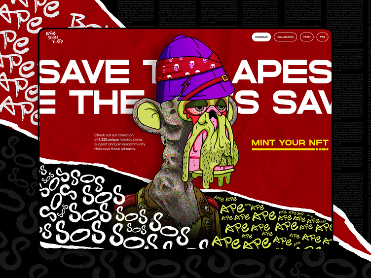
APE BONKEY - NFT Collection website / concept
On the site I have thought about in some blocks - horizontal scrolling
Screen with the founder of the collection
And I've also used cheeky monkey videos on the site, which complement the overall style of the site and blend in with the NFTs themselves
NFT cards I've shown on the site in torn paper style
Hi👋
I want to share a concept I made for the APE BONKEY project. It is a charity fundraiser to save the red book monkeys. So I took the color red as a base and made the design very bold, screaming to draw attention to the 21st century problem. I added the effect of torn out pages, as if the site visitor is leafing through the red book, and the torn out pages are a hint of animal species that are already extinct.
What do you think of the result?
I hope you enjoy it! 😉
Feel free to leave feedback and comments.
Don't forget to click ❤️ if you liked it.
Thank you!!!
I'm open to new projects in different niches. Just email me at:
📪 Email: nikitastavitskiy@outlook.com


