Amphora // Brand identity

Project Amphora stands as an outstanding example of innovation and sustainability. During my tenure at Octoplus Group, I had the privilege of collaborating with Amphora, contributing to shaping their visual identity, packaging, and corporate identity. In this description, I will take you to the heart of this extraordinary project, outlining its purpose, my role, and the challenges faced.
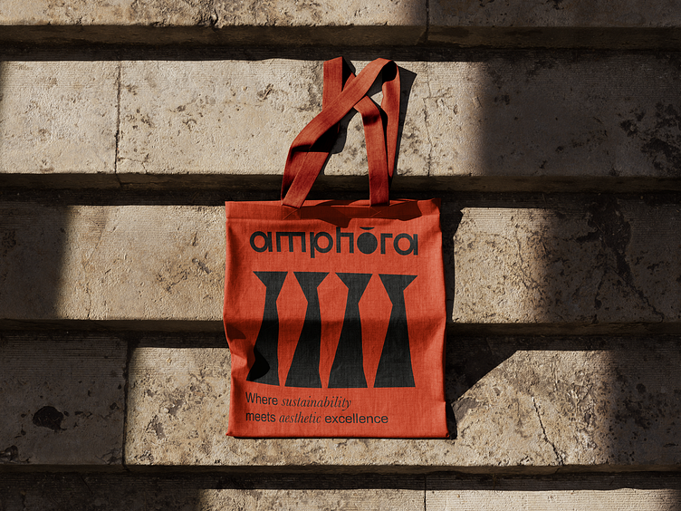
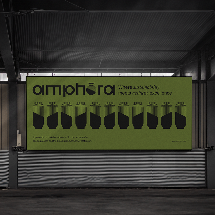
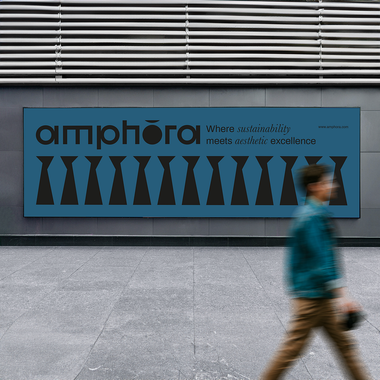
In the context of this project, my role as a graphic designer at Octoplus Group was pivotal. I had the honor of contributing to the creation of Amphora's logo, packaging, and corporate identity. The main challenge was to clearly represent Amphora's ecological mission and its commitment to sustainability through visual design.
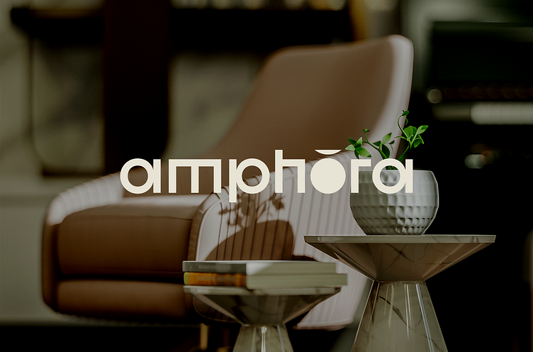
At the core of Amphora's visual identity lies our logo, a minimalist masterpiece skillfully combining a semicircle and a circle to evoke the image of an amphora. What sets our logo apart is its versatility. The circular part can adapt and change shape to reflect the specific element it represents. This approach makes our logo not only distinctive but also dynamic, capable of adapting and personalizing itself for each unique creation.
https://www.behance.net/gallery/180837097/Amphora-Brand-identity