Generation Forty Brand Identity
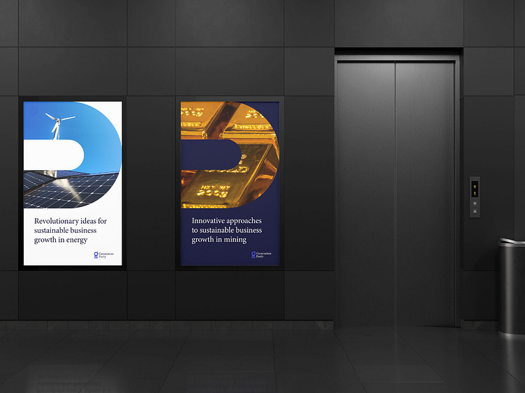
Client: Generation Forty is a dynamic consulting firm at the forefront of transformative change in the agriculture, mining, and energy sectors. With a deep-rooted commitment to sustainability, innovation, and responsible resource management, they are dedicated to shaping a greener, more efficient future for industries vital to global progress.
Problem: Despite its outstanding expertise and progressive values, Generation Forty faced the challenge of establishing a distinctive brand identity that would reflect its leadership in sustainable solutions. They needed a visual identity to encapsulate their role as a bridge between traditional industries and a more environmentally conscious tomorrow.
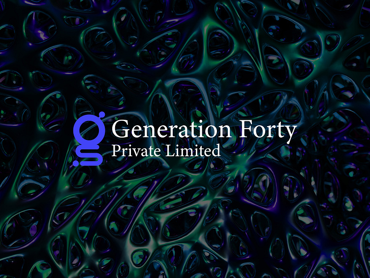
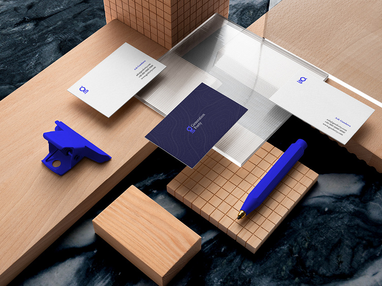
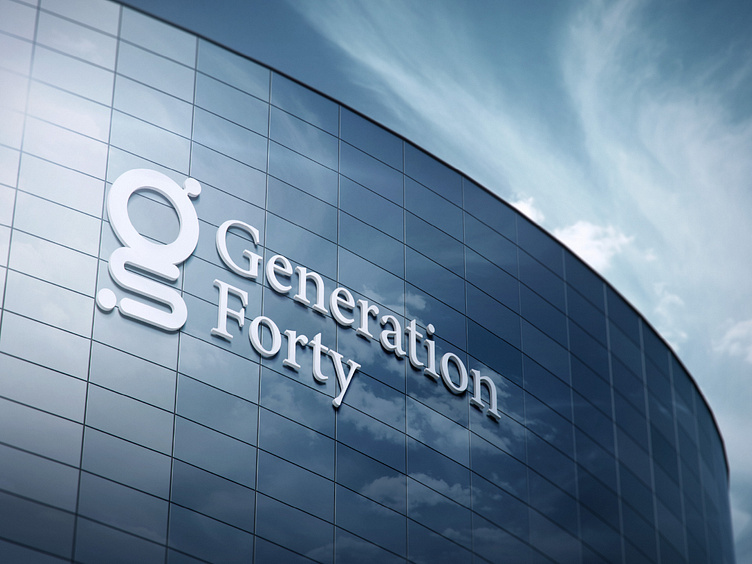
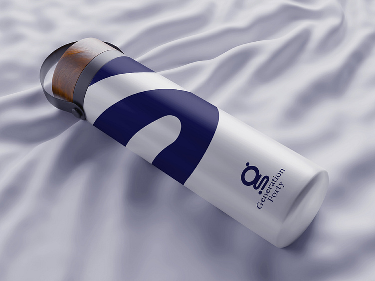
Solution: My solution for Generation Forty was to craft a comprehensive brand identity that seamlessly blended elements of their core industries with a modern, forward-thinking approach. We began by designing a custom letter 'g' logo mark that symbolized growth, progress, and synergy between the sectors they operated in. The Minion Pro typeface was chosen for its timeless elegance, aligning with the firm's reputation for precision and reliability.
Incorporating shades of blue into the brand's colour palette, we aimed to convey trust, stability, and a connection to the natural world. The five distinct shades of blue represented the diverse services offered by Generation Forty within their sectors, allowing for visual differentiation while maintaining a cohesive overall look.

Do you need branding services?
I am currently available for bookings and I would love to work on your brand identity project. You can get in touch with me via email at hi@ashgandawa.com or using the channels below:
🖥️ Website
