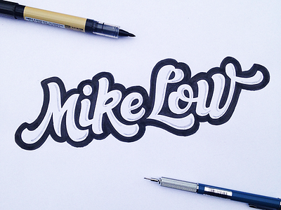
Mike Low logo final sketch
Final sketch here, after having tried many variations. Not sure if we will keep that heavy black border and the 3D shadows but it is still interesting to work with that style to check positive and negative space :-) Hope you'll like it and thanks for your feedback ;-)
More by Francis Chouquet View profile
Like
