Threads Logo Redesign
I didn't like the Threads logo so I redesigned it for my joy.
Designing/Thinking steps
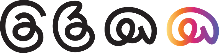
First of all, I thought that it is a social media app which connects people so I connected the lines of it.
When I connect the lines, it didn't seemed beautiful to me so I rotated it around 90°, so it was going to look like a speech cloud. And also became a more beautiful logo after that.
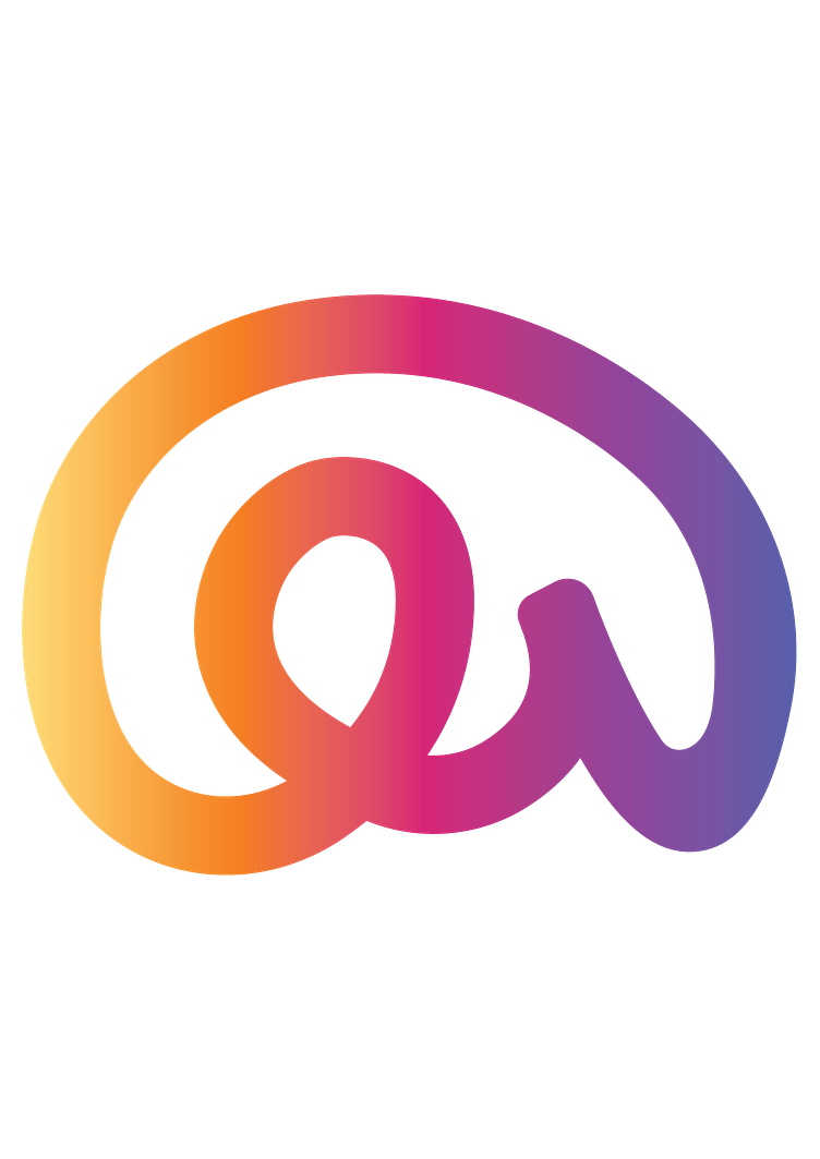
I thought it needed a few more changes to reach its final form. It was too black for a social media app in my opinion. I thought it should be more colorful. And this was a Meta app that integrates perfectly with Instagram, so I picked the gradient of the Instagram logo.
So, here it is.
