Booking App: mobile ui concept
💌 Have a mobile app idea? We are available for new projects!
hello@ronasit.com | Telegram | WhatsApp | Website
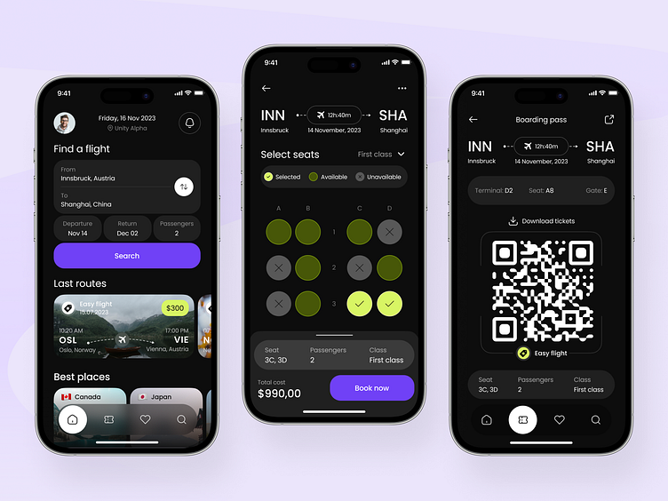
Our team is excited to present to you our design for a flight booking application. The main objective of this app is to provide a convenient and fast way to search, compare, and book available flights from different airlines. It allows users to search and compare flights, book seats, obtain flight information, and manage their bookings anytime and anywhere.
The shot features a main screen with a flight search block. Here, users can enter their departure and destination cities, as well as travel dates and the number of passengers. The screen also includes a section displaying recent flights and a recommendation block showcasing the best destinations. After selecting a flight route, the user is taken to a seat selection page and can proceed to purchase the ticket with a call-to-action button.
The color palette chosen for this application consists of calm and neutral colors, such as gray and white, with bright accents of moderate azure blue and pistachio for buttons and links. This palette was selected to provide a pleasant and non-irritating user experience, especially during prolonged use of the application. It also helps users quickly find the desired information and make choices, as the bold accents draw attention to important interface elements.


