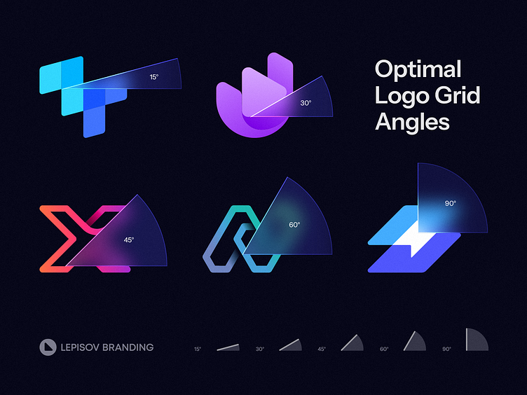
Optimal Logo Grid Angles
Excited to share with you one of the logo design life hacks we use in our process.
This is a set of angle values that are optimal to use in a logo design:
15°, 30°, 45°, 60°, 90° or other angles which values are multiples of 15.
I'd recommend to use these even values instead of the random ones.
These angles form the basic shapes like square, equilateral and right triangles and a hexagon. So using them would help your logos look cleaner and more natural.
Furthermore, integrating even values into logo design streamlines the process of seamlessly extending the logo into a cohesive branding identity. Working on animation, brand pattern creation, icon set design, and even typography layout becomes much simpler when based on these angle values.
Contact us to get your logo design or branding project done:


