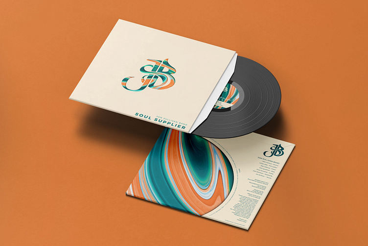
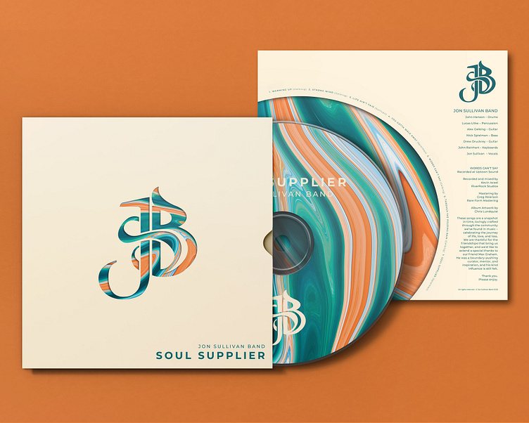
Jon Sullivan Band's New Album
Soul Supplier
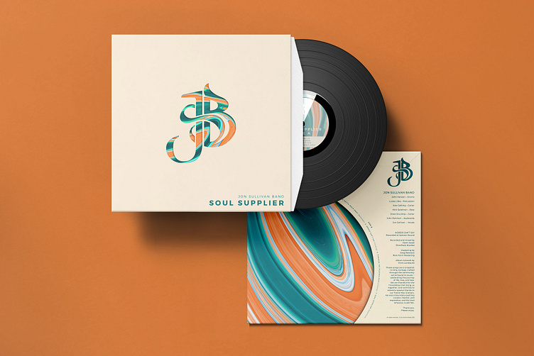
The debut album design for the Jon Sullivan Band.
This unique 7 piece band truly brings an experience to behold in person. Their music is genuinely handcrafted and deep with robust embellishments that make their sound stand out with beautiful colors and harmonies. Trying to encapsulate their aura as a whole for this project has been a wonderful journey.

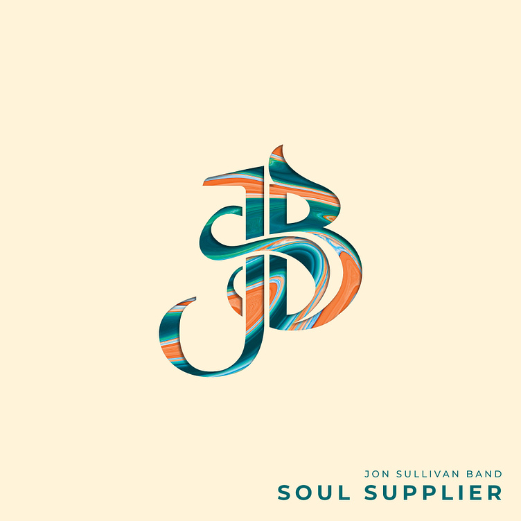
The Monogram
The “JSB” logo mark was inspired by the geometry of the treble clef and the spacial relationship of the letter forms, intentionally using the “S” to wrap both Jon and the “band” together as a strong unified monogram.
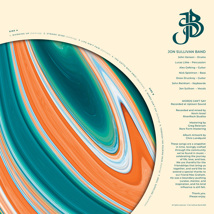
Additionally, the “JSB” mark represents unique motifs using the contours revealing a part each instrument in the band. If you look close, you might see a guitar body, a keyboard, an impression of drums, a mic or even a musical note! The colors of the album were chosen by the band, and symbolize both the diversity and colorful creativity that the Jon Sullivan Band brings to life on stage.