A3 one Color Tute Cover Design | CMYK | Offset Printing
A3 one Color Tute Cover Design
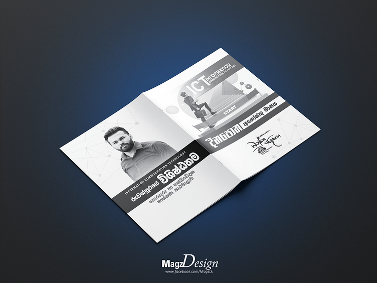
Creating an A3 one-color tutorial cover design is all about minimalism and making a strong visual statement with a limited color palette. Here's a description of what you can aim for in such a design:
1. Simplicity with Impact: A one-color cover design relies on the power of simplicity and minimalism. Choose a single color that resonates with your tutorial's theme or mood. This color will be the sole focus of your design, creating a bold and impactful visual.
2. Contrast and Typography: Use the chosen color for both the background and typography. Create contrast by adjusting the color's tone or shade for text and graphical elements. The typography should be clear, legible, and strategically placed to guide the viewer's attention.
3. Striking Imagery: If your tutorial's subject allows, incorporate a single, striking image or graphic element that aligns with the content. This image should stand out against the background color and serve as the visual centerpiece.
4. Title and Information: Place the title of your tutorial prominently on the cover page using typography that complements the overall design. Include any necessary information such as the author's name, date, or a brief subtitle in the same color scheme.
5. Negative Space: Utilize negative space effectively to create balance and draw attention to the essential elements. Negative space can help highlight key information and make the design more visually appealing.
6. Consistency: Maintain consistency in the chosen color throughout the cover page. This includes not only the background but also any lines, shapes, or accents used in the design. Consistency reinforces the simplicity of the one-color approach.
7. Texture and Patterns: Consider adding texture or patterns to the background color to add depth and interest to the design. These subtle details can enhance the visual appeal while staying within the one-color constraint.
8. Print Considerations: Keep in mind that the design will be printed in a single color, so ensure that your chosen color translates well in grayscale or monochrome printing. Check the design's contrast and clarity in black and white to ensure readability.
9. Emotional Connection: Use the psychology of color to evoke specific emotions or reactions related to your tutorial's content. Different shades of the chosen color can convey different moods or messages.
10. Audience Engagement: Think about how your one-color design will resonate with your target audience. Does it align with their preferences and expectations? Will it pique their curiosity and encourage them to explore your tutorial further?
-----------------------------------------------------------------------------
About Me
-----------------------------------------------------------------------------
🏆 Top Specialties:
- 💼 Brand / Graphic Design (1–2 years)
- 🚀 Product Design (1–2 years)
🏢 Work History:
- 👨💼 CEO at Magzlk.pvt (2020–Present)
🎓 Education:
- 📚 Social Media Marketing & E-commerce, Amezan Lanka Education (2015)
- 💻 Information Technology, SLIATE (2020)
------------------------------------------------------------------------------------------------------------
Let's create visual stories together! 🎨✨
Connect with me for collaborations! 🤝
