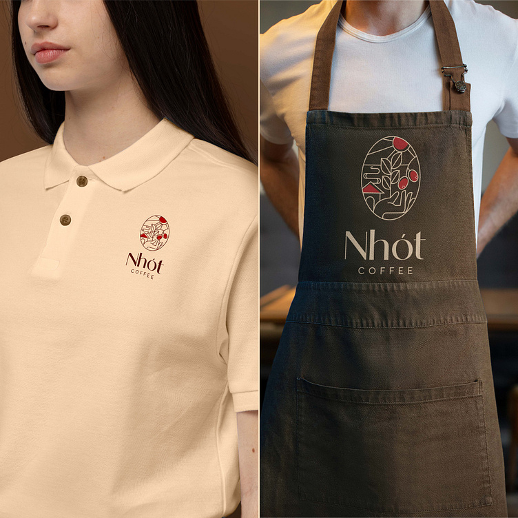
Nhót Coffee | LOGO DESIGN & BRAND IDENTITY
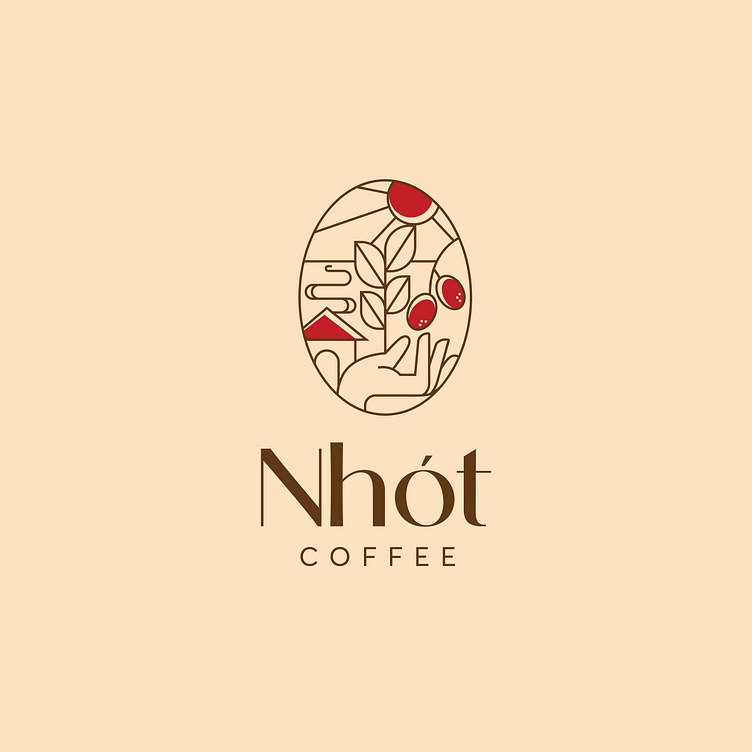
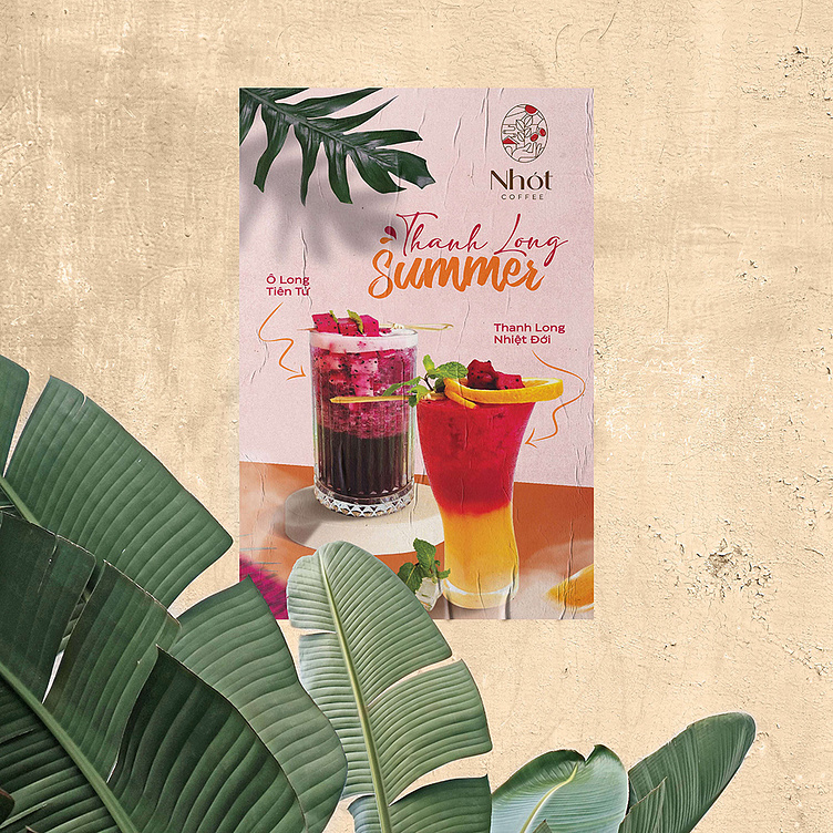
Nhót means "oleaster" in English. This is a fruit grown in many villages in Northern Vietnam especially in Hanoi, loved by many people because of its red color when ripe and its sweet and sour taste.
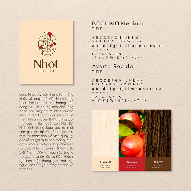
Nhót Coffee logo is inspired by memories of Vietnamese villages in the twilight, when the sunset light cherishes the loitering roofs and each cluster of red oleaster. The image of red oleaster is a familiar image in the childhood of many children in Hanoi. The image in the logo creates a sense of warmth and belonging, as a reminder of going back to traditional roots and values. The red and brown colors in the logo represent the unity and tradition of Vietnam. This is a color that symbolizes warmth and hospitality, creating a space where people can enjoy coffee and socialize.
Designed by Bee Art
-
Client Nhót Coffee
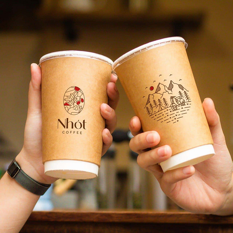
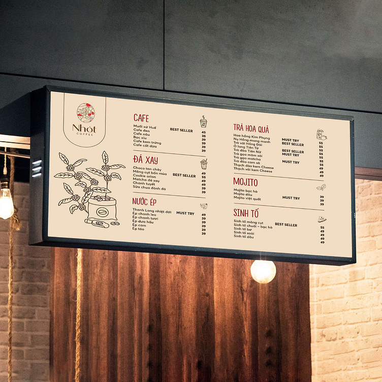
Logo and Branding Project. Logo is designed for a Coffee Brand in Vietnam.
Copyright © Bee Art. All Right Reserved
Contact us:
• Hotline/ Zalo: 077 34567 18
• Email: info@beeart.vn
• Website: www.beeart.vn
• Facebook: https://www.facebook.com/BeeArt.vn

Contact us:
• Hotline/ Zalo: (+84) 77 34567 18
• Email: info@beeart.vn
• Facebook: facebook.com/beeart.vn
