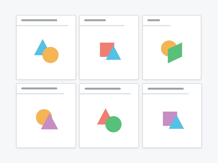
Page Testing Illustration
Here’s just one of the ways we’re using illustrations in the new Litmus app redesign to convey certain messages more elegantly and even for onboarding folks to the app. This metaphor shows a thumbnail grid for one of our existing products called Landing Page Testing. Anyone can test a URL and see the output through multiple browsers like Firefox, Internet Explorer, Chrome, Safari and so forth. Each thumb is going to show a different output, hence the vast variety of shapes and colors.
There’s a lot more in the works, get the full details at: https://litmus.com/whats-new
More by Litmus View profile
Like
