Beak for iPhone: Updated Timeline UI (2)
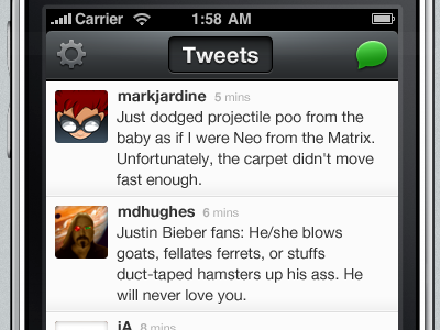
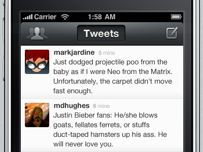
Changed out the accounts icon for a generic settings icon and made it a little darker since you won't be accessing that area much. Got rid of the lame compose icon and replaced with a bright green tweet bubble to really pound the metaphor that you're creating something new and that it's a comment/tweet. I like this a LOT better!
More by Mike Rundle View profile
Like

