Code School Learning Experience
Code School was home to the most fun and engaging online coding courses. Each course had its very own theme— like Dr. Seuss or Zombies— which caused long production timelines and experience inconsistencies for our learners. Our product team improved scalability for course production and usability for learners by creating a consistent interface for Code School's hands-on learning courses (while maintaining Code School's whimsical brand).
Overview
Services
Research, UX/UI design, usability testing
Team
Product Manager, Product Designer (yours truly), and 6 software engineers
Problem
Production for a single Code School course required a 4-6 month timeline. One of the biggest factors that elongated course production was the bespoke theming for courses, which involved custom learning interfaces for each course. This also affected product usability, because learners were required to learn an entirely new interface and experience for each course.
Goal
We wanted to decrease course production time, enable content engineers to efficiently implement courses, and improve overall usability across the product through consistent design patterns, while maintaining the fun themes and brand of Code School content.
Research
Our team conducted 37 discovery calls, which consisted of VOCs (voice of the customer), to understand usability pain points, and CPTs (customer preference test) to validate our hypotheses through prototype observation. The Product Manager and I collaborated with our research team to synthesize the findings and conduct a usability audit across the product's learning experience. From there, we were able to balance tradeoffs and prioritize design pattern and information architecture updates.
Build
Wayfinding
Code School's teams were divided by the marketing website experience and the product/learning experience. The first priority was to align the product navigation with the marketing experience to promote a consistent user flow and information architecture. Our team implemented a new navigation bar with a course outline, progress, and user information.
Challenge types
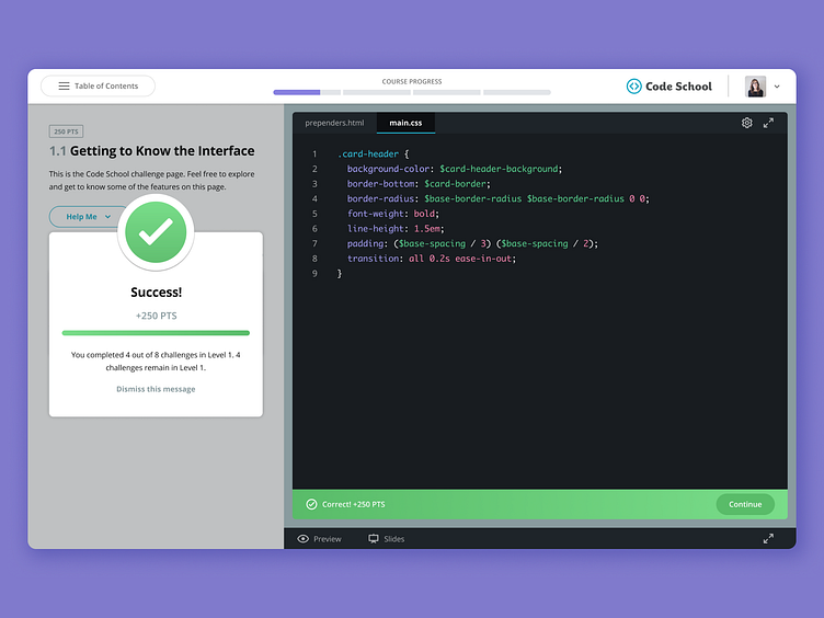
Our content team had a large suite of learning challenges to choose from— like editor and console challenges, multiple choice, fill in the blank, regular expressions. I redesigned each challenge type to have consistent interactions, feedback systems, and a cohesive interface.
Maintaining the brand
Our learners were extremely passionate about the Code School brand and enjoyed the unique themes that each course had to offer. I did not want the new design to strip the product of our personality, so we looked for opportunities to inject theme elements into the interface.
Motivation and celebration
In our research, we discovered a steep learner drop-off after the first level of a course (generally 4-5 levels). If a learner started the second level of a course, then they were ~70% more likely to complete the entirety of the course. This lead me to craft a new course flow with summary pages after each module to celebrate the learner's progress and motivate them to continue the course.
Results
The launch of the new learning experience decreased course production times from 4-6 months to 3-4 months. This enabled the content team to shift from 1 course release per month to 2 course releases. Code School was able to catch up on a backlog of learner content requests and even try new technology areas like Docker and containerization.
The Code School team is the most passionate group of folks that I've ever gotten to work with. The empathy for learners, top notch content quality, and the spark for teaching was inspiring and made this one of my favorite projects to work on.
R.I.P. Code School 🖤


