Lyft iOS Get Started Screen Redesign

One of my proudest achievements during my 3 years at Lyft was actually negotiating all the ins and outs of making the first onboarding screen on brand and consistent with the splash screen. The first two were cognitively heavy videos that were never even fully seen throughout their 15s runtime by 99% of the traffic. Additionally while nobody watched them they added something like 10% to the overall size of the entire app. In 2016 I was successful in preventing the sign up flow from being turned into a rainbow tunnel that changed colors between every login. However my time between 2018-2020 was spent advocating for getting rid of this off-brand Baja Blast teal screen that was put in by the "marketing-branding" team. I hope you enjoyed the consistency the white screen brought to your first impression of the brand and the onboarding flow. After all the whole point was to get you, our customers to spend less attention on it and ride more.
If you like it, don't hesitate to click "L" 💗 or "F" + "Follow"
👇 Follow us and get the app now + review us 🌟
Sprocket Bicycle App on Android
Sprocket Bicycle Blog on Instagram
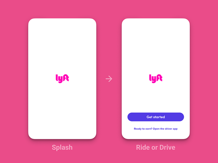
Another major aspect to the design of this screen was the seamless transition from the splash screen into it - so that it finally felt like 1-less screen. This further reduced the cognitive load and made the app feel faster and more responsive. Even though this feels insignificant it actually reduced the choice fatigue on someone trying the app for the first time and increased the chances they would activate and take their first ride substantially 🚲🚗

