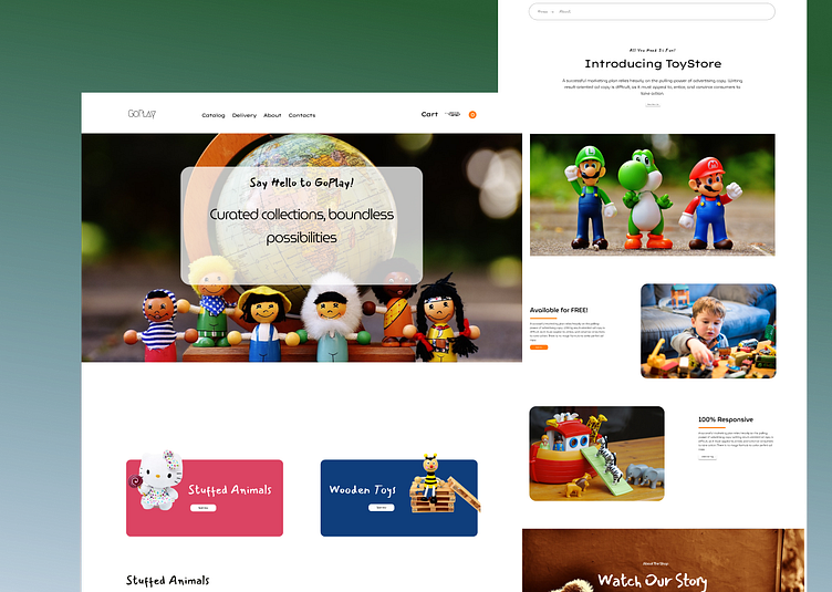
Interactive Toy Store Website Design
Designing a toy website using Figma involves creating a visually appealing and user-friendly interface to showcase various toys and products. Below, I'll provide a detailed overview of the key elements and considerations for designing such a website:
1. Header:
- Logo: Place the website's logo at the top-left corner for brand identification.
- Navigation Menu: Include clear and concise navigation links to different sections of the website, such as Home, Toys, Categories, About Us, Contact, and possibly a Shopping Cart or Wishlist icon.
- Search Bar: Add a search bar for users to quickly find specific toys.
2. Hero Section:
- Large, eye-catching image or slider displaying featured toys or promotions.
- A catchy headline that introduces the website and its offerings.
- Call-to-Action (CTA) button that directs users to explore products or shop now.
3. Product Listings:
- Organize products into categories (e.g., action figures, board games, dolls) with clear and clickable thumbnails.
- Include product names, prices, and brief descriptions.
- Add filters and sorting options for a smoother user experience.
4. Product Details Page:
- Detailed product images, including zoom-in capability.
- Product description, features, and specifications.
- Pricing, availability, and add-to-cart/wishlist buttons.
- User reviews and ratings.
- Related products or recommendations.
5. Shopping Cart and Checkout:
- A user-friendly cart icon with the number of items.
- Cart page to review and edit selected items.
- Secure checkout process with multiple payment options.
- Order confirmation page.
6. About Us:
- Information about the company, its mission, and values.
- Team or founder profiles.
- Customer testimonials or success stories.
7. Contact Us:
- Contact form for inquiries.
- Contact details such as phone number, email, and physical address.
- Location map.
8. Footer:
- Navigation links for quick access to important sections.
- Social media icons for sharing and following.
- Privacy policy and terms of service links.
- Copyright information.
9. Visual Design:
- Choose a color scheme that aligns with the toy industry, possibly using vibrant and playful colors.
- Use high-quality images and icons of toys and children engaging with them.
- Ensure the website design is responsive to different screen sizes and devices.
- Implement clear typography and legible fonts for content.
10. User Experience (UX):
- Prioritize a user-friendly, intuitive interface.
- Implement breadcrumbs for easy navigation.
- Optimize loading times for images and pages.
- Incorporate hover effects and animations for interactive elements.
Remember that the design should reflect the target audience's interests, such as parents shopping for toys for their children, and provide a seamless shopping experience. Additionally, regular usability testing can help refine the design for optimal user satisfaction.
