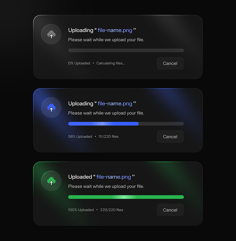
Upload Card Dark UI Design
Sharing a sneak peek of my recent UI design experiment – an uploading card element with a sleek dark theme and a glassy look. Designing small UI elements like this is a creative delight, where every detail matters. Excited to hear your thoughts and feedback!
What do you guys think? Let me know in the comments section!
Hope you guys enjoy it. Press "L" if you like it.
Thank you !!
----------------------------------------------------
I'm available for a new project, let's collaborate -
mitesh.ux@gmail.com
👇Get in touch with me
More by Mitesh Samal View profile
Like
