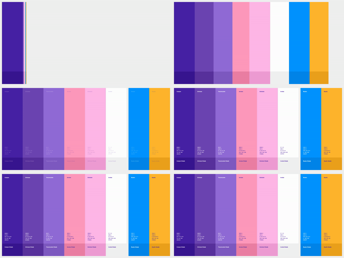
Vizard Color Palette
Let's talk about brand differentiation with color 🟣
When approaching the brand evaluation for our partners at Vizard, we knew that their target audience is non-professional video editors, therefore Vizard had to feel effortless for the time-strapped content marketers and social media managers trying to get a timely Reel produced and published. Appropriately, the Vizard team identified their brand attributes as Effortless, Transformative, and Essential.
From there, we arrived at their Single Most Important Thing (SMIT): Enchantingly Intelligent. The new Vizard brand needed to capture that sense of magic when a technology works effortlessly.
From a brand standpoint, Vizard’s competitors blend together in techy blues, gradients, and nondescript sans serif typefaces. You could easily research each competitor and struggle to remember which is which; that meant an exciting opportunity for Vizard.
The color palette features an analogous scheme with subtle transitions between colors, creating a magical feeling and bringing the brand to life.
Vizard’s gradient is one of the more flexible elements of the brand. It can range from two to five colors depending on the available real estate and desired composition. The soft transitions between colors feel effortless, but enchanting, like a mysterious potion brewing in a cauldron.
Check out the full case study: https://odibrand.agency/work/vizard
---
Looking for a brand agency? We would love to hear from you.
Email us: hello@odibrand.agency


