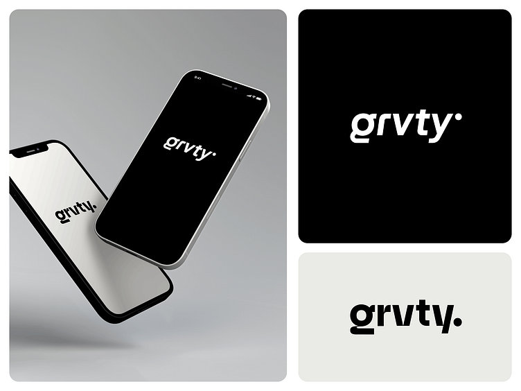
Grvty logotype - Direction 1
The first logotype concept & alternative presented in the initial presentation for Grvty - a social media app connecting sports fans with stars.
This brand identity project had to be done in a very short amount of time which usually stresses me a lot... 😬
But with Grvty, I had such pleasure exploring different directions not only because I love playing with lowercase g-s (I mean who doesn’t 😎) but because of the people behind Grvty who are one of the most empathic and easygoing clients I’ve ever worked with. 🙌
I don’t know if it’s just me, but when crafting concepts for a brand, I often connect with the emotions I’ve experienced interacting with the clients. Which in this case was in my favor. 😅
We (at KICKFLIP) presented four logo options in total and the clients loved them all! Ah, designer’s dream! 🤩The decision on the final logotype was made together and the favourites were this direction and the chosen one which I will show you soon.
What are your thoughts on this direction?

