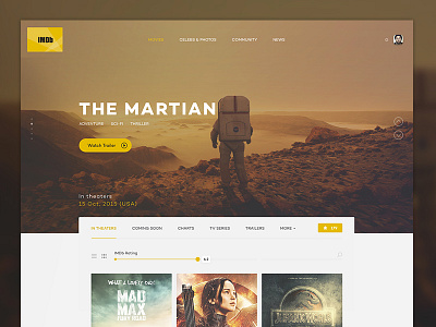
IMDb design concept
I know that this been played a lot of times already, but I decided to take a shot on this one as well. I think that IMDb needs to be simplified a lot and each section should serve it's own needs.
Main stuff:
• Instead of showing small previews of trailers, use large image to make more visual impact and stronger CTA. • Simple use of search and filters • Strong accent on filtered content • Star as "rating" indicator is not fancy anymore :) Decided to use heart for this.
Hope you like it! More coming soon!
More by UVIO View profile
Like

