Monster Hunters Quest Menu UX/UI Design
Enter your text here...Monster Hunters is a UI/UX project I've been working on for a few weeks, but it is based on a Dungeons and Dragons game I've created and ran since 2021.
It begins in the Walled City of Dunwich, where our player is part of a Monster Hunting Guild, and their job is to kill monsters.
My campaign setting I've created is a harsh, bleak and scary world. It is inspired by many horror novels and films, as well as games like Bloodborne, Sekiro and Dark Souls, so I wanted to main menu to reflect this cold dark style.
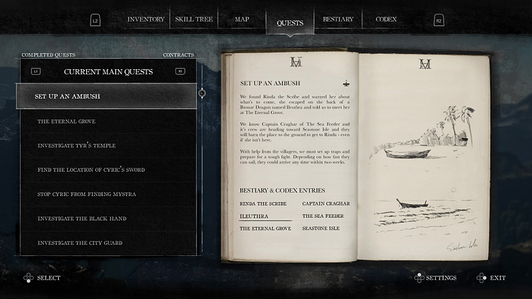
Enter your text here...The top menu is navigated with the left and right triggers. The part selected by the player will be highlighted and it's container will have an arrow pointing to the main text of the page below.
Within this page, the player can use the bumpers to navigate their current main quests, monster contracts, completed quests and completed contracts. Like the main menu, this is highlighted with a glowing box and an underline.
All interactable text is using the same font "OldStyle", this is another indication to the player that anything in this font can be selected.
To navigate the issue of longer quest text, I've created a pop up menu when the right analogue stick is pressed. Here I've also made the text clearer for a better accessibility option.
If the player moves to the right instead of going down the Main Quest list, they can interact with the Bestiary and Codex entries. Whatever selected will take them to it's corresponding entry for more information. These are highlighted to the player using the underline and the selected text increases by 5pt.
The drawings on the right are small sketches done by the players character to give the player additional information about the quest, through a more visual means. The quality of these drawings are effected by your characters Dexerity stat.


