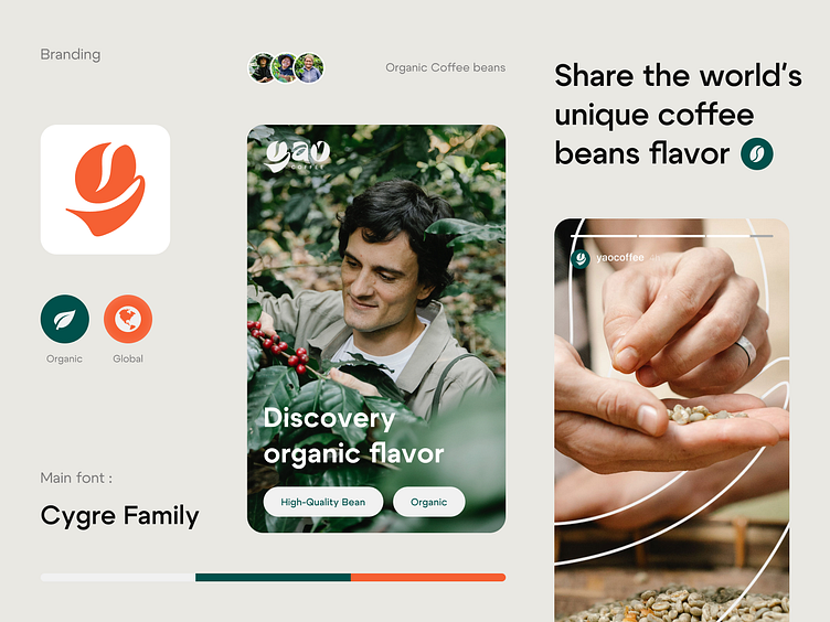
Yao Coffee - Visual Identity
Yao Coffee - visual identity
Hi everyone! Today I will share my latest project that I've done recently. Yao Coffee was founded to tell the worldwide coffee story. Exploring a new country starts with the discovery of a unique coffee flavor. Made to guarantee freshness, our specialty coffee is the ultimate opportunity for organic flavor discovery and global variety.
The Concept
I use the coffee bean as the main shape of the "Y". For the tails, I tried to make it flowy and imitate the leaf shape to get an organic/natural feeling on it. I made the custom font for the "yao" words to make it more unique and stand out.
Using the "Y" shape on every material gives it a dynamic and unique feeling, and also the freshness of the brand.
So what do you think?
If you like my design, please consider appreciating it with a like or "Press L" ❤️
------------------------------------
Feel free to contact me at Dwi Aryasa
Connect with me here :

