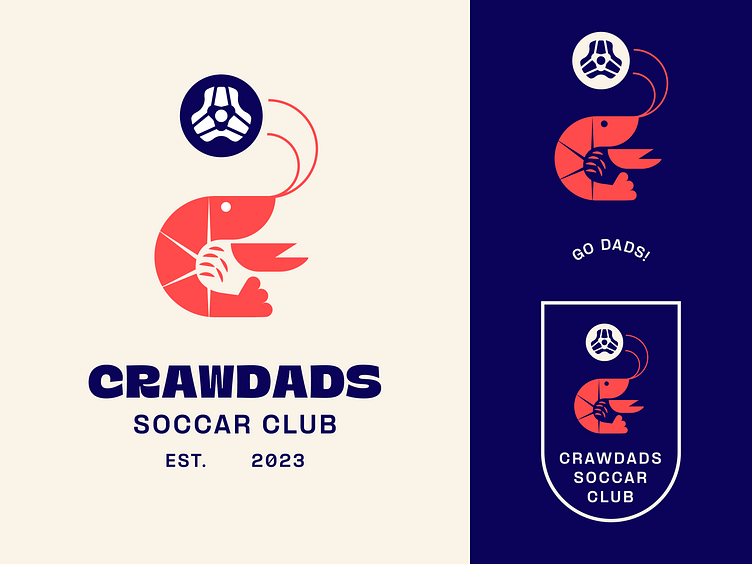
CrawDads Soccar Club
I created this logo for my friend group who comes together to play Rocket League. It presents a stylized crawfish, configured to form a ‘C’. This choice not only stands for “CrawDad” but also a significant regional symbol, giving the logo a personal and local touch. One of the defining elements of this design is the incorporation of the Rocket League ball at the apex, where the crawfish’s antennae seem to be influencing the trajectory of the ball. This element adds a sense of motion and direction, giving life to the logo and reinforcing the gaming aspect of the team’s identity.
More by Alex Torres View profile
Like
