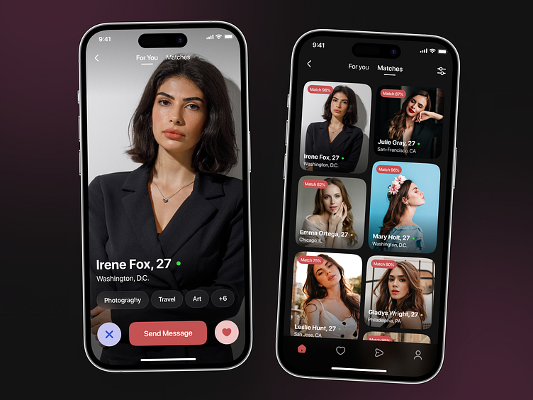
Dating App UI
💌 Have a dating app idea? We are available for new projects!
hello@ronasit.com | Telegram | WhatsApp | Website
Swipe right if you're ready for an amazing dating app experience! Let's dive into the details of our latest design concept.
The first screen presents an endless scroll of user profiles for users to swipe through. The second screen showcases short information about user’s matches. Lastly, the third screen displays the chat interface where users can connect and communicate.
The color palette for this app incorporates a dark theme with soft touches of red, creating a positive and friendly atmosphere within the app.
More by Ronas IT | UI/UX Team View profile
Like


