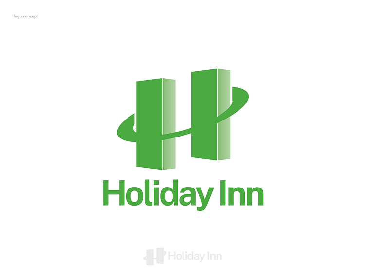
Aesthetic Harmony: Redefining the Holiday Inn Logo
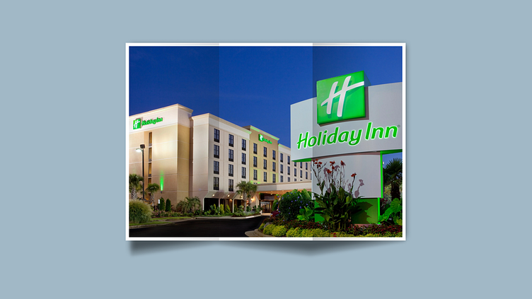
🏨 The Challenge: My recent stay at a Holiday Inn hotel in Mexico left me intrigued by the discrepancy between the playful logo and the stylish, discreet atmosphere of the hotel. The logo, with its playful icon and typography, conveyed a different message than the hotel's actual ambiance.
💡 My Creative Journey: I couldn't resist the urge to reimagine the Holiday Inn logo. I began sketching my vision, focusing on the essence of holidays—bringing people together and uniting families.


🌟 The Result: The redesigned logo now portrays two buildings, cleverly formed by the sides of the "H," and an embracing eclipse ring represented by the "-". This design symbolizes the message of Holiday Inn—a place where people come together and find comfort. The typography was refined using "Public Sans" for a symmetrical and calming effect.