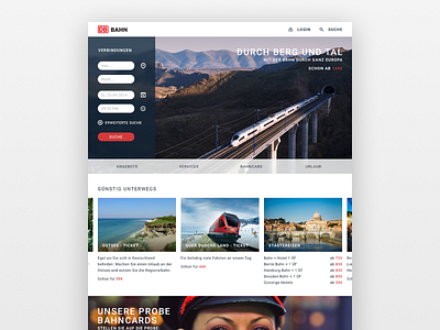
DB Bahn – Website Redesign
Hello fellow Designers,
this is my quick shot at a redesigned interface for www.bahn.de, the website of "Deutsche Bahn" here in Germany.
I simplified the look, took unnecessary content out and tried to make the UI as clean as possible. For me the connection search feature of the website stands out as the most important so I tried to keep the focus on that. On the top of the page you have a simple search, the logo and a login function. Then there is the big search teaser which takes the focus. The rest of the menu moved underneath that because I believe thats really only important if you don't just want to search. If that is the case, then that menu and that content will be focused.
That's basically my thinking behind the design here. There are some full res' shots in the attachment area! :)
Thanks and I would really love some feedback! :)


