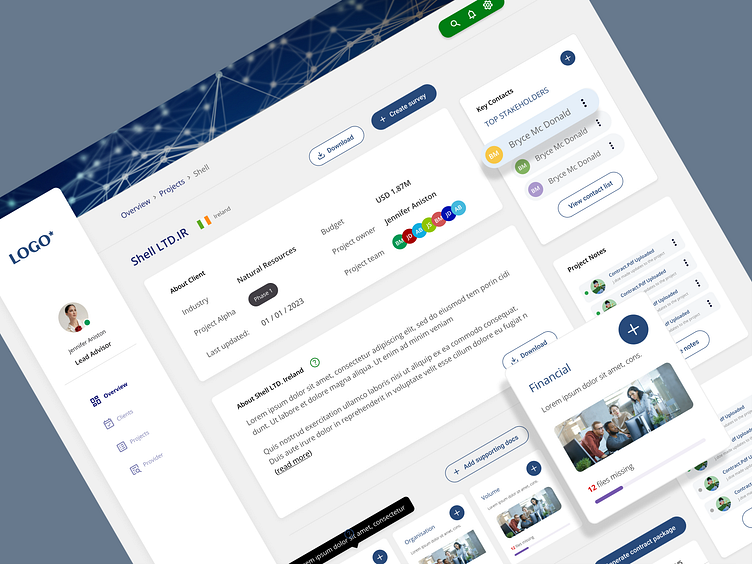
Dashboard design
Problem:
The mobile redesign of Company X's dashboard is aimed to address is the need for a more intuitive and user-friendly experience. The existing dashboard had several pain points:
Complexity: The current design was overly complex, with an overwhelming amount of information and features. Users found it difficult to navigate and understand.
Inefficient Workflow: Users struggled to complete common tasks efficiently due to a lack of clear pathways and logical organization of features.
Lack of Customisation: Users had limited control over the dashboard's appearance and content, hindering their ability to tailor it to their specific needs.
Mobile Responsiveness: The existing dashboard was not optimized for mobile devices, limiting usability for users who frequently accessed it on smartphones or tablets.
Solution:
To address these issues, I designed a new dashboard interface that focuses on simplicity, efficiency, and customisation. Here are the key components of our solution:
Simplified Layout: I streamlined the layout by prioritising the most important information and actions. This reduces cognitive load and helps users quickly find what they need.
Clear Navigation: I implemented a straightforward navigation structure with easily identifiable menus and icons. This allows users to move through the dashboard with ease and confidence.
Customisation Options: I introduced customisation features that enable users to personalise their dashboard. They can choose which widgets to display, rearrange elements, and set preferences for a tailored experience.
Responsive Design: The dashboard is now fully responsive, ensuring a seamless user experience across various devices, including desktops, tablets, and smartphones.
Methodologies Used:
User Research: I conducted user interviews and surveys to understand pain points and gather insights into user preferences and needs. This research guided our design decisions.
Information Architecture: I employed principles of information architecture to organize content logically and create a clear hierarchy of information.
User Testing: I iteratively tested our designs with real users to gather feedback and make improvements. This iterative process helped us refine the dashboard's usability.
Prototyping: I created interactive prototypes to simulate the user experience and validate the design's functionality and flow.
Responsive Design Principles: I followed responsive design principles to ensure that the dashboard is accessible and usable on a variety of screen sizes and devices.
UI Design Guidelines: I adhered to UI design best practices, including using a consistent colour scheme, typography, and visual elements to create a cohesive and visually appealing interface.
Development Collaboration: I collaborated closely with our development team to ensure the feasibility and smooth implementation of our design.


