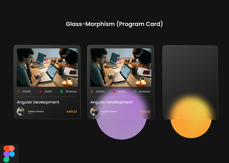
Daily Challenge | Day 6 | Glass-morphism Program Card
Hi Dribblers,
🎯 Today's challenge is to design a user-friendly and visually appealing Glass-morphism Program Card
Discover the transformative power of Glass Morphism in UX/UI design! 🔍✨ Glass Morphism, a sleek trend inspired by frosted glass, infuses your program card design with transparency and depth, creating a visually stunning user experience. 🎨💻 It's not just about aesthetics; Glass Morphism enhances user interaction. Subtle shadows and blurred backgrounds make navigation intuitive and engaging. 💡
What is Glass Morphism?
Glass Morphism is a design style characterized by its use of transparency, blurriness, and a sense of depth to create visually striking and immersive user interfaces. It draws inspiration from frosted glass and frosted acrylic materials, providing a sleek and modern look that captures the user's attention.
The impact on User Experience
The beauty of Glass Morphism lies not only in its aesthetics but also in its ability to enhance user experience. By introducing subtle shadows, blurred backgrounds, and translucent elements, you can guide users' focus and make interactive elements more intuitive. This approach can help users navigate through your program card effortlessly, resulting in a more enjoyable interaction
I hope you guys like it and appreciate it
#DailyUIChallenge #DesignJourney #UXUI #DesignCommunity #CreativityUnleashed
Have a UI/UX Project? pasindu.neto@gmail.com | pasindum.uxerblend.com
