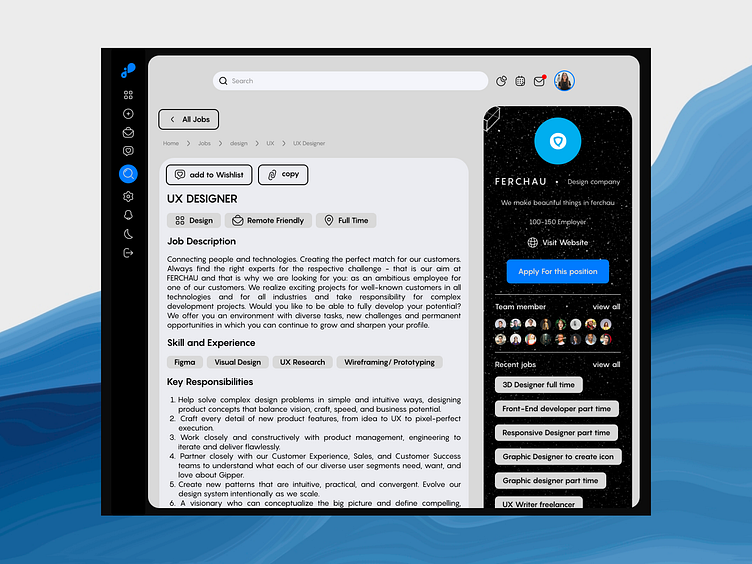
Hiring page for a job search platform 🧐💼
Hey, awesome folks of Dribbble! 👋✨
I'm thrilled to share a sneak peek of my latest design —a sleek and user-friendly hiring page for a job search platform! 🚀✨
In this shot, I've focused on creating an intuitive interface where job seekers can effortlessly access crucial job details while getting a glimpse of the hiring organization's profile and related advertisements. 🧐💼
The design features a clean layout, allowing users to quickly spot the perfect job opportunity and explore more about the hiring company. 🏢💡
Feel free to share your thoughts and feedback! 🗨️ I'm always eager to hear your valuable insights. And hey, don't forget to connect with me on my social networks for more design adventures!
Let's connect on LinkedIn | Behance | Medium | Twitter (X) for more design tales and a sprinkle of creativity!
This page is also shown in the image below but with sidebar mode open. It can be opened by entering the mouse into this sidebar for a more precise menu selection 👇👇
Cheers to amazing opportunities and great designs! 🌟💫
#DailyUI

