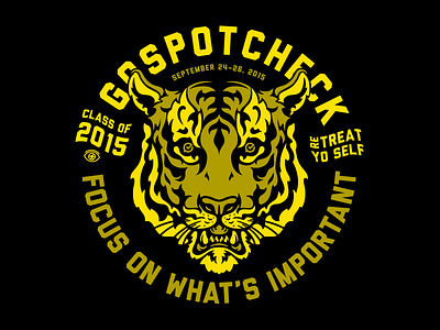
GoSpotCheck 2015 Retreat
Our GoSpotCheck brand colors are orange, white, and black. So after 3+ years, it seemed fitting that I finally illustrated a bad ass tiger. Ironically, the shirts got printed in yellow, but cool none the less...
Sometimes in design you make something because it's cool, and then work your way back through the reasoning. I started with the tiger, then moved to the "eye of the tiger" theme, which then fit perfectly with our 2nd company value: "Focus on what's important". A secondary sleeve print says "Eyes on the prize".
We take our company values seriously at GoSpotCheck, and after an amazing retreat, I find myself yet again amazed at the company, and more so, the team, we've become. GooooOOOOOoooooSpotCheck!
More by Brennan Gilbert View profile
Like


