Data Heavy Dashboard Design
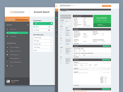
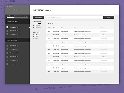
Just realized I never showed the end result of the wire I posted awhile back. When you get deeper into the options (ie: account listing > account screen > orders for account) the sidebar minimizes to not only put the focus on the data and options but also allow for all of that data to exist on a single screen without being even more robust.
Each of the sections on the right screen (black header with white content box below) can be minimized. If the logged in user prefers certain ones open/closed that setting is saved as the default the full outline of data is relevant to what that user needs to see.
Enjoy.
More by Candorem View profile
Like

