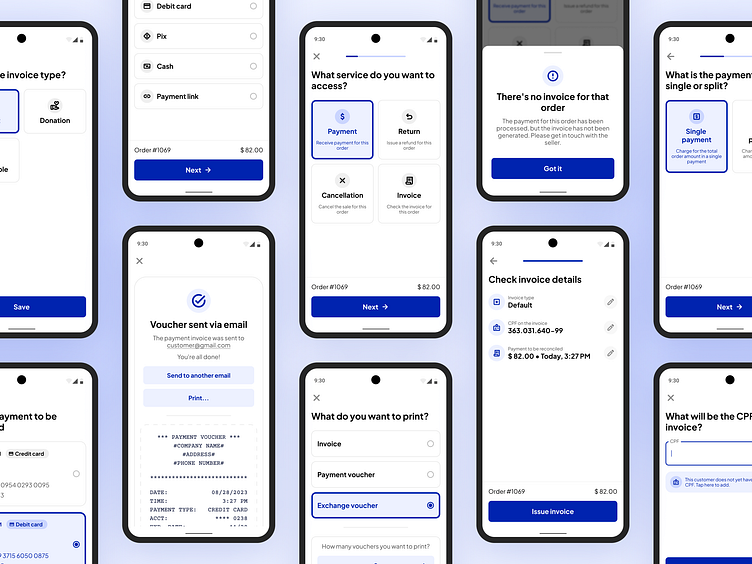
Iglu • POS Software Redesign
Context
Iglu is a Brazilian SaaS startup that provides a Point of Sale (POS) software. They entered the market with a Minimum Viable Product, which had a great acceptance from early users. However, as the MVP was majorly designed by non-designers, it had a few UI and UX flaws. So I was brought on board to lead a redesign effort, whose goals were mainly to fix known UX issues, address user feedback, and bring a visually appealing design.
Objectives
1. Reduce cognitive load
I tried to achieve this by restructuring each screen to focus on a single task, eliminating distractions and ensuring users could interact with the software one step at a time. I tried not only to simplify the user experience but also to make overall usability smoother.
2. Optimize for agility
Given the target users are vendors, often operating in fast-paced environments, I created a design to cater to their efficiency needs. I created prominent, easily tappable components and made the most commonly used options pre-selected in each screen to minimize steps in the process.
3. Enhance self-explanatory design
The software contains intricate and occasionally complex concepts. To mitigate user confusion, I added small on-screen descriptions to provide instant context. The idea was to reduce reliance on external resources, such as help centers or documentation.
4. Create design consistency
To prevent users from getting confused and questioning why components behaved differently in various parts of the software, as it happened before, I maintained design patterns: each component has a singular, predictable behavior.
Design Process
1. Understanding the challenge
The project started by the client sharing a list of desired improvements, primarily driven by customer feedback. Users expressed concerns about small buttons/components and how this, as well as a few laggy interactions, affected the time they had to spend to go through the whole flow.
2. Low-fidelity drawings
I initiated the design process with low-fidelity drawings. I used fat marker and paper, then scanned the drawings and organized them on Figma. These initial concepts were shared with the client through a Vimeo video record in which not only I presented the drawings but also shared the rationale behind my design decisions, inviting feedback and suggestions.
3. Wireframing
Transitioning to wireframes after two rounds of feedback with the low-fidelity drawings, I maintained the same feedback process, ensuring client expectations and project objectives were met. This phase allowed for a more detailed exploration of the user interface, including an initial design of the main components within an initial design system.
4. High-fidelity design
After a few major decisions in the previous phase, the final stage involved translating the wireframes into high-fidelity screens and also improving the initial design system. I kept the same interaction/feedback approach from the previous stages: recording videos on Vimeo to explain the rationale behind my design decisions and to ask for feedback.
Design System
While I was designing the solution, I also worked on a small design system to maintain consistency and to facilitate future enhancements. As the project and my alignments with the front-end team evolved, so did the design system. Once I finished the high-fidelity screens, I revisited and refined it. Here's a glance of the finished version:
Results
As of now, the project hasn’t been rolled out to users, so I still don't have information about outcomes and the impact on user engagement. I hope I can share them with you here soon, though!
--------
Thanks for stopping by! Please press "L" if you liked it ❤️


