Mediaweek 2022 Variable Blackletter Typeface
Building an evocative and dynamic brand that reflects the evolution of media amidst Web3, Metaverse, and Crypto disruption.
Mediaweek 2022 was launched during the peak disruption of Web3, the Metaverse, and Crypto. The event had historically covered the changing media landscape, and 2022 was an unprecedented time, which the branding needed to reflect and communicate. Mediaweek, under the Adweek family of events, needed to communicate this message of disruption while maintaining a visual connection to its past events, and to Adweek as a whole. The trusted Blackletter typography and CMYK printed halftones of media’s old guard were juxtaposed against the neon vibrance of RGB pixel clusters and modern, bolded sans-serifs. This stark contrast highlights and boldens the essence of the media’s ongoing metamorphosis. The lines between these iconographies were blurred in the Mediaweek 2022 Branding. This blurring of lines served a dual function. Practically, it served as a means to organically pair two visual themes that might not, under most circumstances, pair well. By taking a magnifying glass to that contrast, we turned a jarring clash into a feature, not a bug. Secondly, by blurring the lines between Blackletter/Sans-serif and CMYK/RGB, we communicated the idea that the current media landscape was anything but easily defined or understood. The industry was enmeshed in a state of flux that defied a clear explanation.
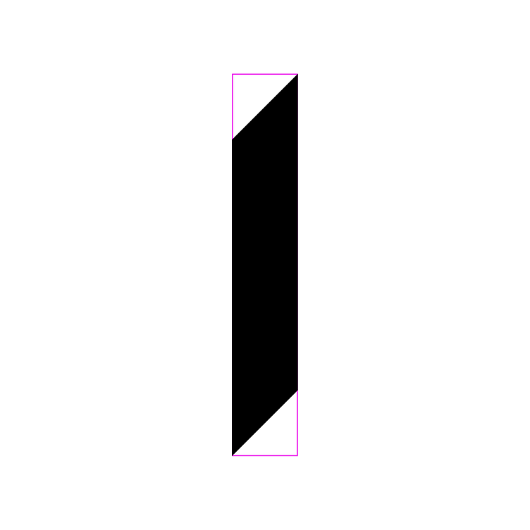
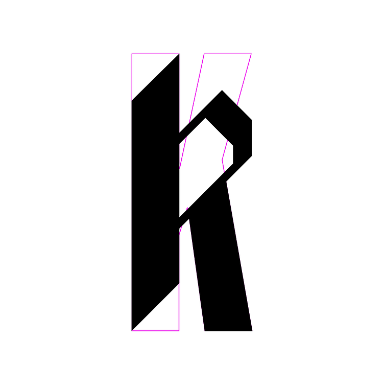
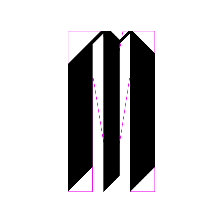
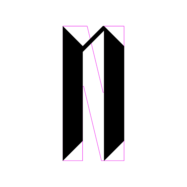
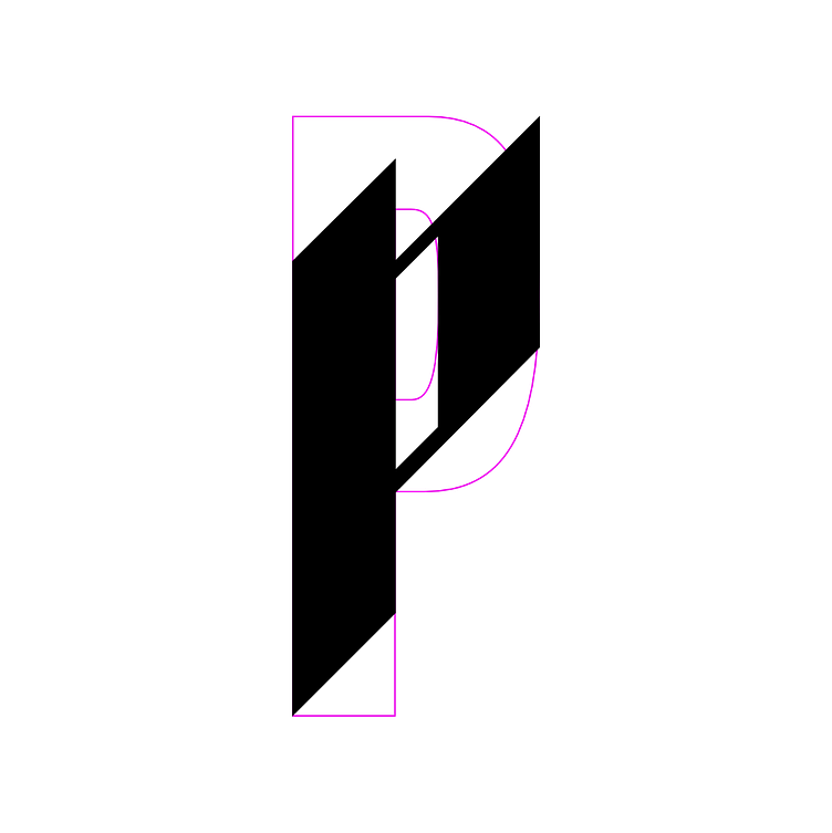
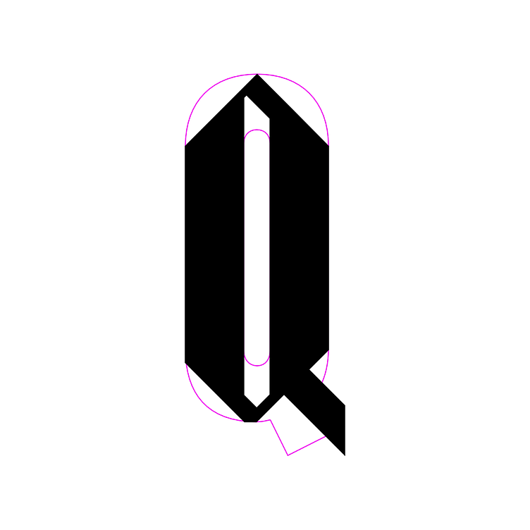
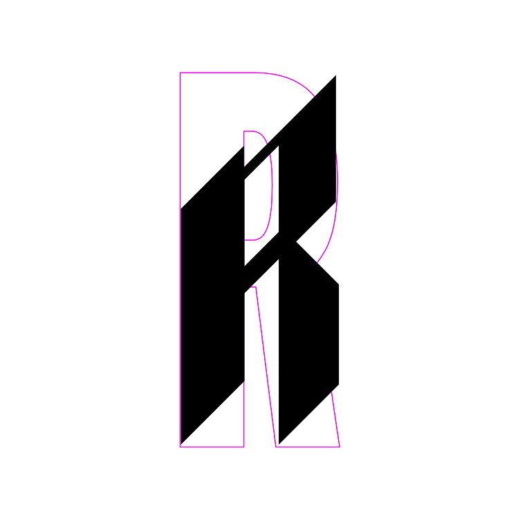
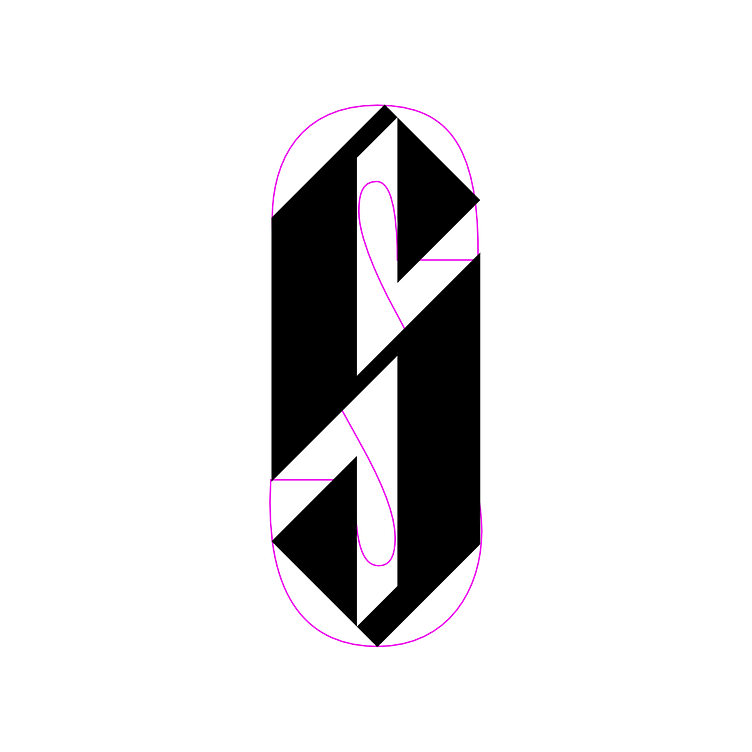
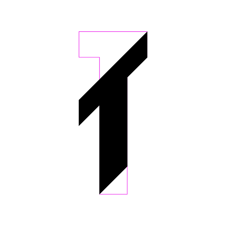
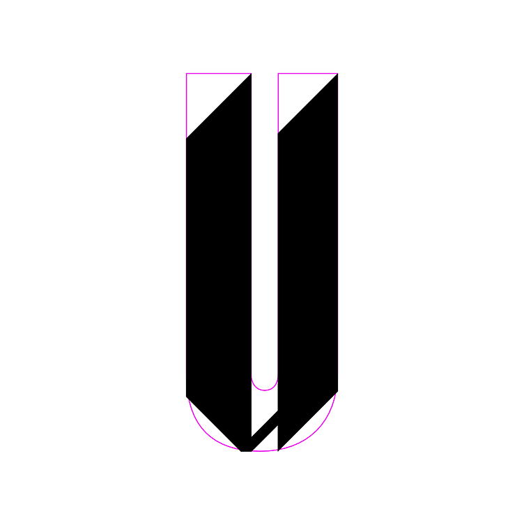
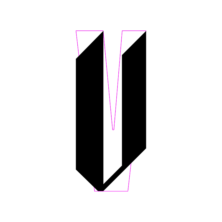
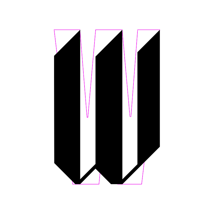
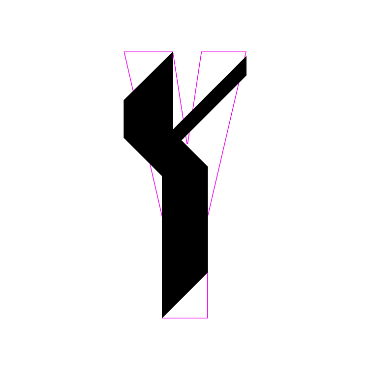
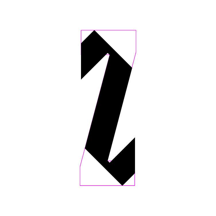
The Mediaweek 2022 Variable Blackletter Font utilizes an icon of traditional print media to illustrate the state and pace of change in the media environment.
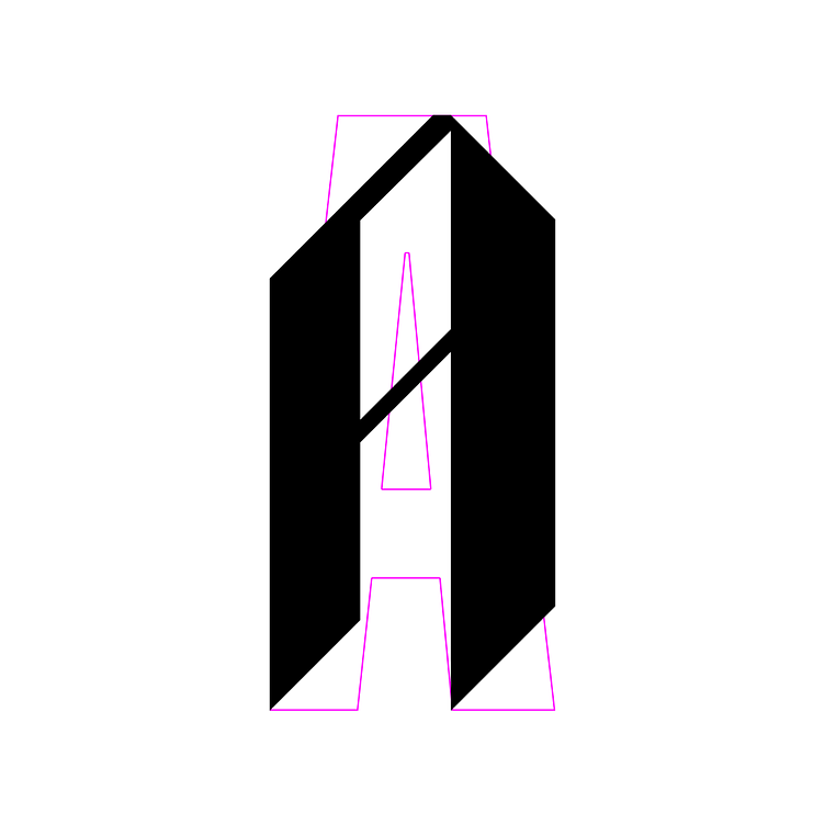
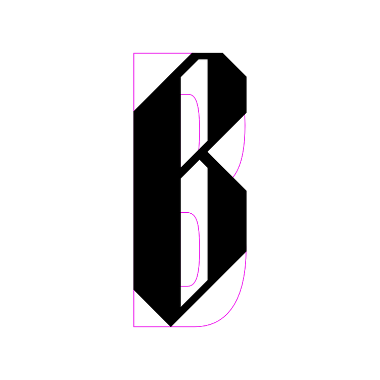
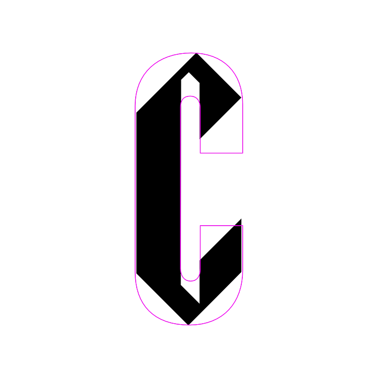
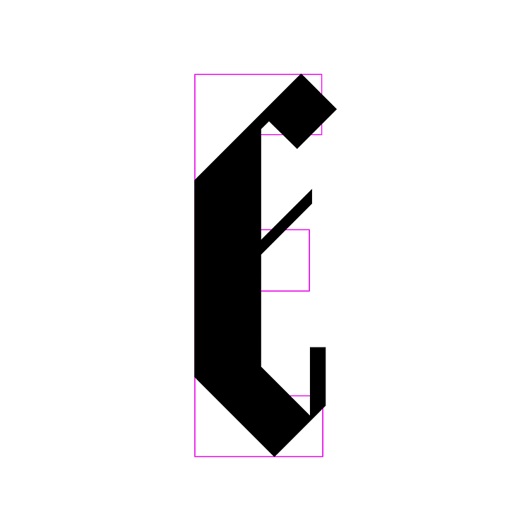
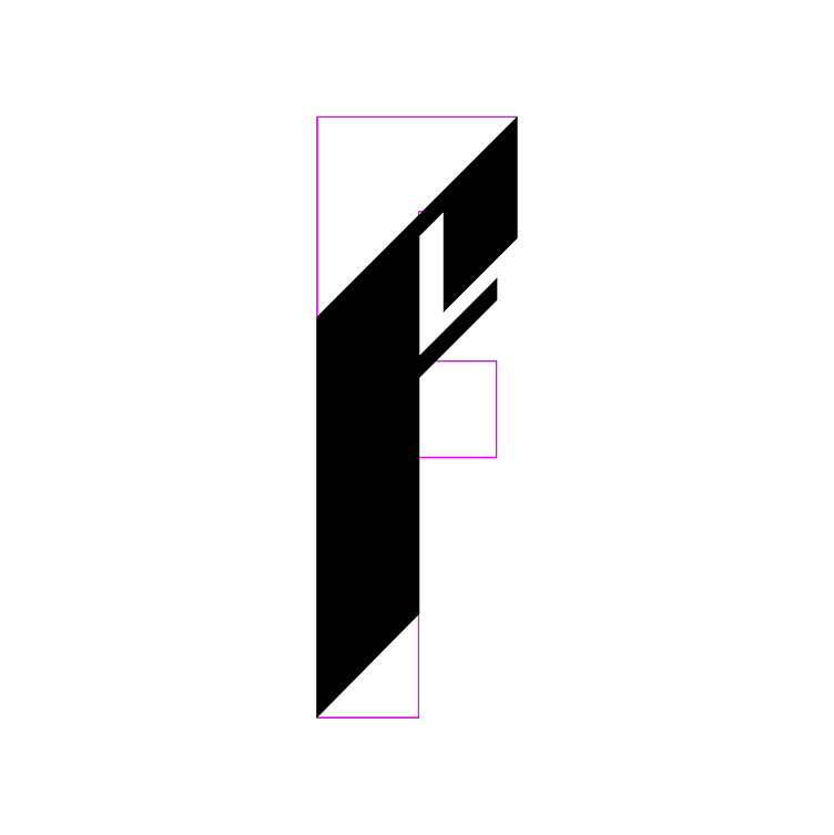
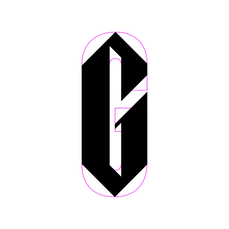
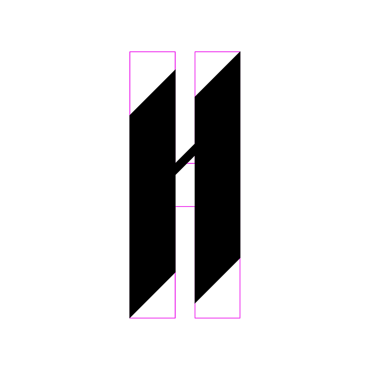
A Blackletter font inspired by the brand's primary font, Flama, to function as one of the primary visual elements for the 2022 Mediaweek event branding. The font's dynamic design ensures effortless stretching and transformation in motion creating a fluid transition between the base Flama and blackletter characters and allowing it to adapt to fit a variety of contexts.
Designed using the standard brand font as a foundation to help it fit in while standing out.
The Mediaweek Blackletter font was created to reflect the evolution of media in the context of new and emerging formats. With the Metaverse in the spotlight and the future feeling closer than ever, we used motifs from traditional media to create contrast and emphasize the event's forward-looking themes. The dynamic blackletter font can fluidly transition to the more contemporary sans-serif Flama, mirroring the transformation of media from traditional to modern mediums.
From the very start, the blackletter font was designed not only with the form of the base Flama glyphs, but points that formed them as well. This was important to ensure smooth, natural transitions between the blackletter and base glyph by reducing the number of redundant or unneeded points in either state.
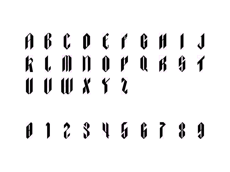


All the characters for all of the applications.
The original 7 characters used to set the primary event lockup (A, D, E, I, K, M, W), were expanded out to include an uppercase for all 26 standard latin characters & 0-9 numbers. Being one of the primary visual elements in the brand, the font needed to be able to be utilized for any potential copy.
Designed to be warped and manipulated.
Beyond illustrating the evolution from traditional to modern media, the blackletter font was designed to embody the multi-faceted, and hyper individualized contemporary media landscape. Ideas and messaging needed to adapt to a wider more diverse array of contexts than ever before. Warping the type by means of stretching was taken into account when drafting the glyphs, to allow for designers to warp them to their needs on a case-by-case basis, beyond a standardized set of preset warp states. In this way, the type could mirror how media content had to be transformed to adapt to everything from legacy print sources, to the still uncharted and ill understood metaverse, and everything in-between.
Channel shift, from CMYK printing to RGB pixels
To further the theme of the transition between old and new media, both the CMYK color palette and halftone printing dots were adapted into a modern context. The RGB Channel split effect, popularly used to communicate technological themes was contrasted against its print heritage with offset printing layers in CMYK. This pattern of CMKY offset halftone printing provided a highly dynamic and flexible tool to provide a punch of color to the otherwise monochrome branding, in addition to providing designers a means to brand assets without over-using the more visually loud blackletter font.
Abstraction of the CMYK offset halftone theme
While many applications of the of the CMKY offset halftone were utilized in a more Litteral and representative manner, these colorful dots allowed for a more abstract utilization as well that brought select moments in assets to life with an exciting flurry of color.
This abstraction was heavily utilized in the branding of the physical space on digital signage. These atmospheric assets, having less information to convey, opened up for the brand to really come alive and show off.
The solid foundations and flexible structure of the branding and font allowed for a continued experimentation and evolution in application throughout the campaign.
From the course of the event campaign, from initial launch through run of show, the flexible nature of the branding in conjunction with the solid thematic foundations they were designed on, allowed our team to continually explore new possibilities with the elements, while retaining the core brand identity. By the time assets were being created for the venue, the team was able to develop visuals that didn't just feel like a stale iteration of the same ads that have been circulated for the length of the lead-up, but rather an evolution that felt both natural and exciting.
While most if not all marketing materials are viewed on smaller screens like phones and laptops, the venue provided a larger, more immersive canvas, that we were able to take full advantage of.
