Le Cordon Bleu - Website Redesign 2023
This was one of my latest and largest projects which includes both UX and UI leadership and whole process. Most important expectations was to refresh it graphically make it more up-to-date and modern and also lower the percentage of users that drops the buying process during course/schooling application.
About company
Le Cordon Bleu is a multinternational Culinary University which provide courses in terms of cooking, pastery, restaurant/hotel management and much more. Company asked me if i can redesign they website to make it more appeling and up-to-date so firstly i started to learn about they bussiness goals and current website. Soonly i found out that it's a University but with build in e-commerce solution for making applying for courses and schooling much faster and easier.
Appeal
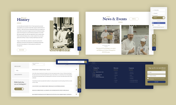
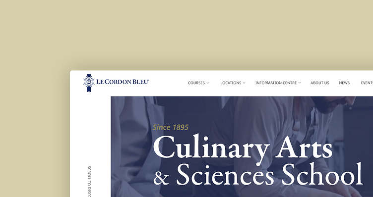
First thing i've done was to load the website with explanatory videos about courses, university and testimonials to make informations more easy to gain and to learn about the offer of the company.
Simplyfying course browsing
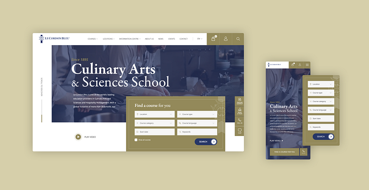
In older website there was very hard to find what users where looking for - i simplyfyied the process of searching courses adding huge search area at the front page with a lot of filters to find exactly what users where looking for in a vast University offer. With simply "apply" which was e-commerce "add to cart" button.
More browsing functionalities
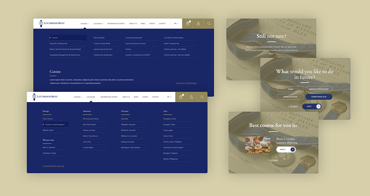
But in the end i've added much more courses browsing functionalities - like for example mega menu with seperation on locations and courses categories for easy browsing. Another one was a simple quiz - after answering some question it provide you with best course for you!
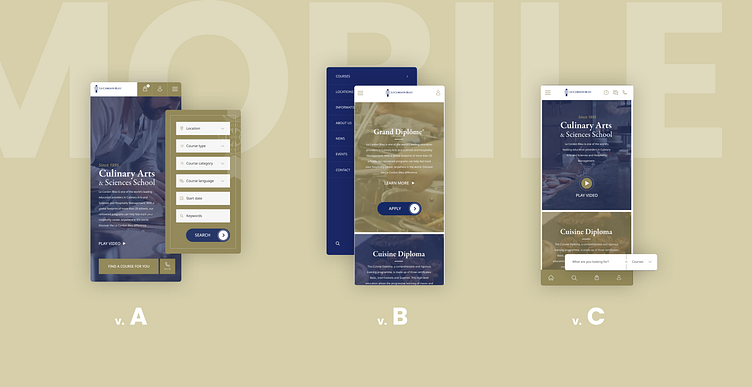
Mobile
Next step was to create mobile version for the website - i've came up with 3 different versions for future user testing. Version A was exactly like desktop and B and C much more simplified.
User Testing
It comes time for user testing. I performed tests with aproximetly 15 users and feedback was very good.
UI Feedback
Users reported that website looks very professional and at first glance they could recognize by design that the school is very sophisticated and provide pro, high class services - which was exactly what i was aiming for.
To describe they feelings about the overall feeling of looks of the website they where using terms like: "professional", "classy", "tastefull", "appealing" etc.
UX Feedback
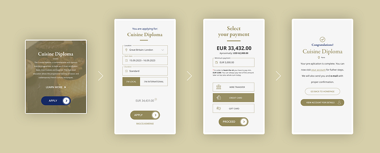
In terms of UX they where also very happy with ease of use, finding what they wanted to find and applying for courses. But in the end i simplyfyied applying to less steps resigning with e-commerce cart and make it as a single "apply" and shortening process to just 3 easy steps.
Overall Feedback
Overall feedback of users was very satysfying. After performing all the tests they needed to evaluate the website and the experience and the lowest rate was 8 on a 1-10 scale. It was greate success - time to code this website :)
That's not all
I also made a lot of other functionalities like "Support Center", lot of possibilities to connect in order that someone will need some help - like: chat, phone call, whatsapp and much more.