Form Mobile View
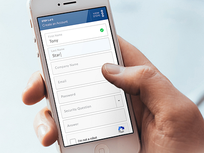
Early concept of a form I designed while at LSQ.
The idea was to keep the label contained within the field and also visible on focus. so forgetful users (like myself) woud have visual access to the input label while also making it easy for the eye to clearly see each input at a glance of the entire form.
Positive feedback was also important and so we included the green-check-cirlce to let users know they are doing it right!
More by Brenden Greenwood View profile
Like
