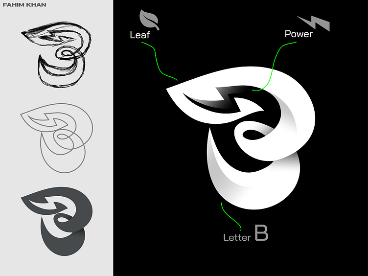
Empowering Sustainability with "B Leaf Volt" Logo
Case Study: Empowering Sustainability with "B Leaf Volt" Logo
Introduction:
I take pride in crafting unique and impactful visual identities. The "B Leaf Volt" logo is a testament to my dedication to creating meaningful designs for forward-thinking brands.
Project Overview:
For this project, I was approached by a visionary renewable energy startup in need of a distinctive logo that would encapsulate their commitment to sustainability and innovation.
Design Objectives:
The client sought a logo that seamlessly integrated the letter "B," a leaf, and a power volt. Additionally, the color white was chosen to symbolize purity and sustainability.
Design Process:
1. Conceptualization:
- I began by ideating on paper, sketching various arrangements of the elements. This phase allowed me to explore different compositions while keeping the design simple yet powerful.
2. Digital Rendering:
- Once a promising sketch emerged, I transitioned to digital tools. With precision and attention to detail, I transformed the concept into a clean, scalable design.
3.Incorporating Feedback:
- As a solo designer, feedback is invaluable. I sought input from the client and made iterative adjustments to ensure the design aligned with their vision.
Design Rationale:
Integration of Elements:
- The "B" is seamlessly incorporated within the negative space of the power volt , representing the brand's identity. The power volt elegantly extends from the leaf's stem, signifying the company's focus on energy solutions.
Color Choice:
- The use of white embodies purity, cleanliness, and sustainability. It reinforces the brand's dedication to environmentally conscious practices.
Client Feedback:
The client was highly satisfied with the final design. They appreciated the simplicity and symbolism of the logo, which effectively communicated their brand values.
Results:
The "B Leaf Volt" logo successfully achieves the following objectives:
- It succinctly communicates the client's commitment to sustainable energy solutions.
- The minimalist design ensures versatility across various applications.
- The white color choice reinforces the brand's dedication to eco-friendly practices.
- The logo stands as a memorable and recognizable symbol.
Conclusion:
This project demonstrates my ability as a solo designer to create impactful visual identities that resonate with a brand's values. The "B Leaf Volt" logo is a powerful emblem of the client's dedication to a greener future.
🤝 Let's Explore a Collaborative Opportunity to Elevate Your Brand!
For all inquiries and consultations, please feel free to reach out:
📧 Email : helloofahim@gmail.com
☎️ WhatsApp: Click here to initiate a conversation 💬
I look forward to discussing how we can enhance your brand together.


