Login Spacing

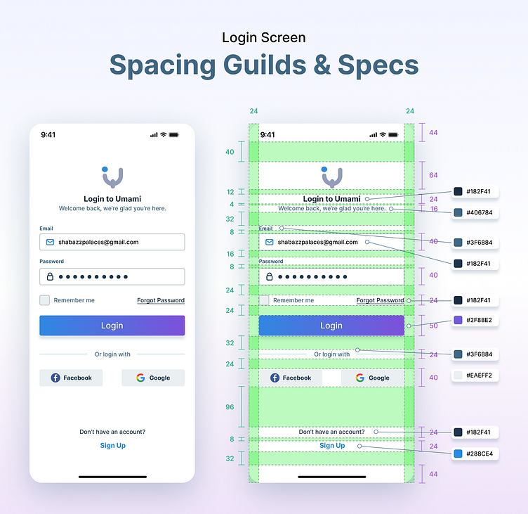
Mobile Login Mockup Description:
This mobile login mockup is designed with a focus on clean and intuitive user interaction. It follows a minimalist design approach with an emphasis on user-friendly features and aesthetics. The mockup adheres to the brand's color scheme, primarily utilizing a calming combination of cool blues and whites.
Header: At the top, there's a company logo placed with a generous margin from the screen's edges. The logo uses the primary brand color as the background, ensuring it stands out.
Login Form: Beneath the header, there's a well-organized login form with adequate margins from the sides. The form fields for username/email and password maintain a clear visual hierarchy, with subtle placeholders and a hint of the brand's secondary color for borders.
CTA Button: The "Login" call-to-action (CTA) button is prominently displayed in a contrasting color, making it easily accessible and inviting for users. It's centered with sufficient margin from the form fields, ensuring it doesn't feel cramped.
Forgot Password Link: Below the login button, there's a "Forgot Password?" link in a smaller font size but still legible. It's positioned with a slight margin to avoid clutter.
Social Login Options: For added convenience, social login options (e.g., Google and Facebook) are presented below the form. Each social login button is distinct, employing the respective platform's recognizable colors while maintaining a consistent margin from the form.
Footer: The mockup includes a subtle footer with minimal information and links. The footer elements are strategically placed at the screen's bottom, providing ample margin to prevent overcrowding.
Background: The background of the mockup is a soft gradient that complements the primary color scheme, creating an inviting and visually appealing login screen.
This mobile login mockup ensures a harmonious blend of margins, colors, and design elements, focusing on a seamless user experience while staying true to the brand's identity.