UX audit - Registration and Log in (Dôvera)
Hello Dribbble community!
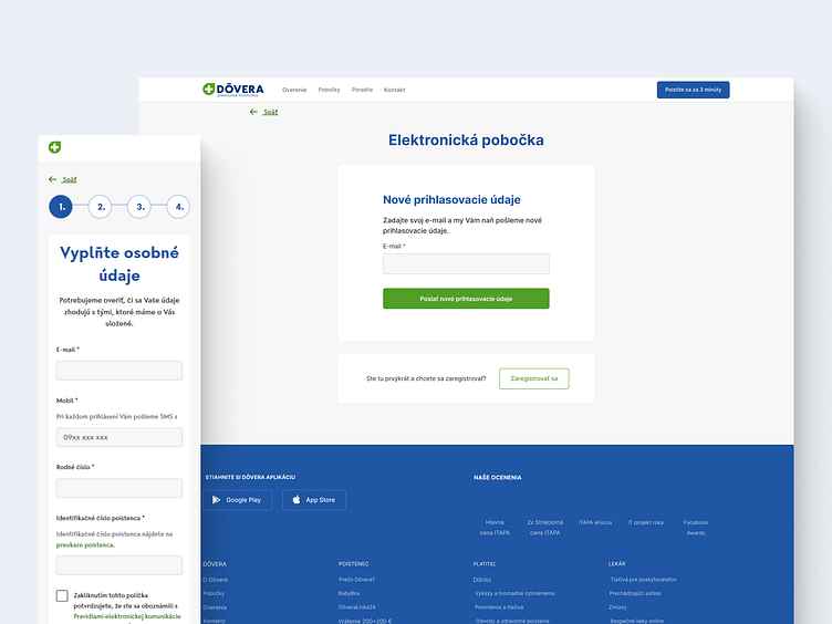
I would like to share with you my UX audit of the current Registration form and the Log in form (February 2023) from the website www.dovera.sk.
The aim of this audit was to uncover usability problems.
To speed up this process and then modify the current design, I used the GoFullPage plugin in browser and the html.to.design plugin from the Figma community.
With this audit, I want to show you how I think and how I focus on users' and company's needs.
My outputs represent possible suggestions for redesigning the current forms (February 2023).
What is good (UX explanation):
each step in the registration form is visible and indicates what is going to happen in the next step,
there is an error message about the wrong format of the email address,
there are light grey numbers in the mobile field that indicate in what format should be filled in the mobile number,
in the registration form, the checkbox is big enough to click on it and also text near this checkbox is clickable,
text with the label “Pravidlami elektronickej komunikácie so spoločnosťou DÔVERA zdravotná poisťovňa, a. s.” is clearly shown as a a colored and clickable link that leads to another page called “Pravidlá elektronickej komunikácie”,
the eye icon in the password field in the login form starts to be visible when filling in the field,
button “Prihlásiť sa” is visible, readable and has a label that indicates what is going to happen,
button with the label “Nepamätám si prihlasovacie údaje” under the button “Prihlásiť sa” is clearly visible and indicates what is going to happen,
in the login form the button with the label “Zaregistrovať sa” is clearly visible for those who don't have an account,
there is an active state when filling in the field,
there is an error message about a required field,
required fields are marked with the red indicator.
What is good (Conversion rate optimization):
main CTA button “Prihlásiť sa” in the login form is clearly labeled and has a high contrast (no potential drop-off point here),
top aligned labels help users to fill in forms faster and to move down the form in one visual direction (this allows the users to complete the form first try),
error messages inform users in real-time (it increases conversion).
What needs improvement or to be fixed (Conversion rate optimization):
button with the label “Pokračovať” doesn't indicate what is going to happen in the next step of the registration form in the mobile version (solution: button with the label of the following step with an arrow can add emphasis on going to the next step and can be A/B tested on real users to find the most optimal conversion rate),
button with the label “Nepamätám si prihlasovacie údaje” leads to the registration page and not to the page on which a user recovers the account (this may cause users to abandon the form).
After this audit, every single change needs to be A/B tested with real users to find the most optimal conversion rate.
We need to test:
whether it reduces the number of steps in user flow,
whether it improves navigation,
whether it increases a conversion rate.
Let me know what you think. Your feedback and appreciation are always welcome.
Thank you :)
Mirka


