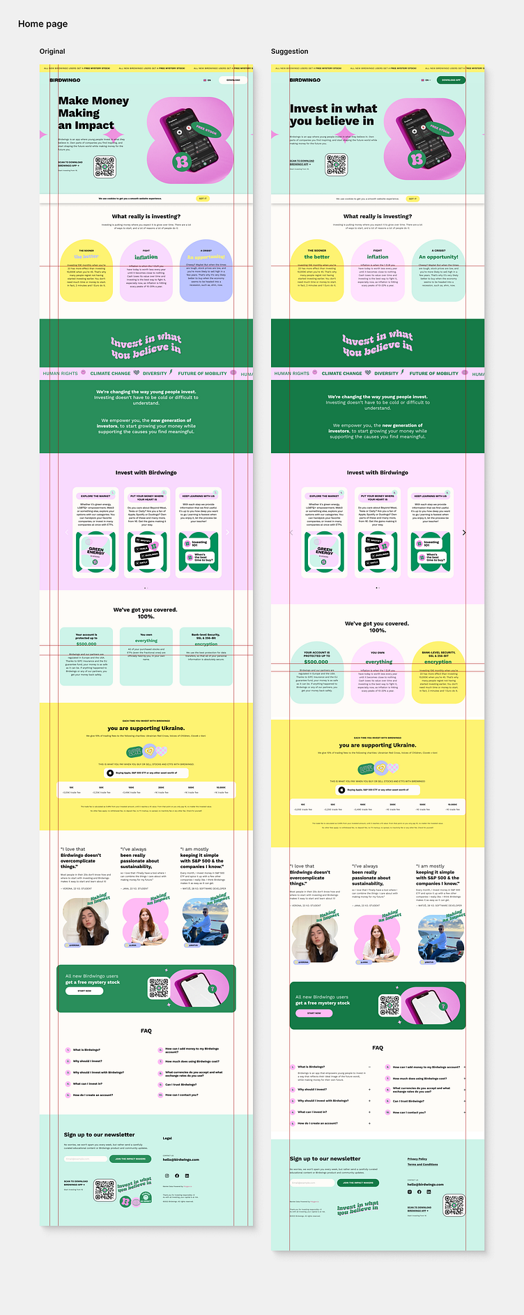
UI and UX audit - Home page (Birdwingo)
Hello Dribbble community!
I would like to share with you my UI and UX audit of the current version (November 2022) of the website birdwingo.com.
The aim of this audit was to uncover usability problems.
To speed up this process and then modify the current design, I used the GoFullPage plugin in browser and the html.to.design plugin from the Figma community.
My outputs represent possible suggestions for improvements of the current website (November 2022).
Overall:
to align the content within the website, I set the same margin for the left and right sides of the website,
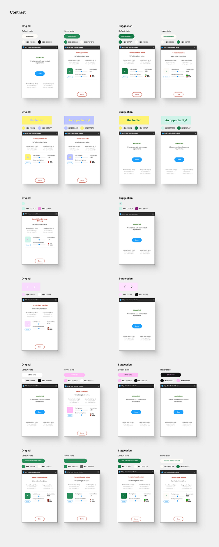
to more emphasize the CTA buttons in the whole website in default and hover state, I changed the background color and color of the text of these buttons,
to unify the interaction, I suggest using the same interaction (Popup) for text near the QR code in whole website as it is used on the “DOWNLOAD” and “START NOW” buttons (in the current version of the website the user can click on the QR code in “HERO SECTION” but in the “START NOW” section and in the “FOOTER” section the QR code act as a not clickable image).
Navigation bar:
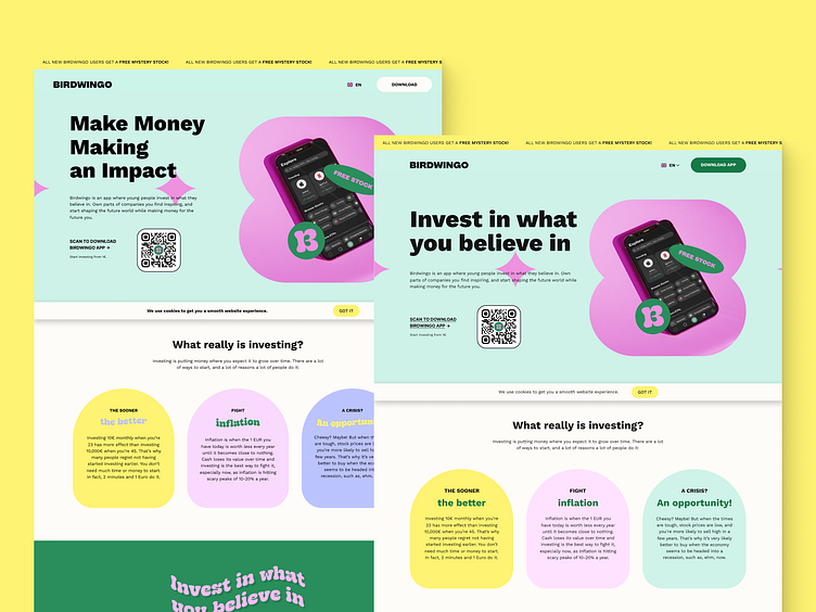
to inform more the user about language options, I added an chevron next to the language (this chevron informs the user that there is more than one language to choose from),
to more emphasize the CTA button called “DOWNLOAD”, I changed the background color of the button from white to green in the default state.
Hero section:
for more clarity on what value this company provides, I suggest using a headline that does not evoke questions but answers on what this company does.
Content:
to be consistent, I aligned the content within the boxes that are next to each other (boxes in sections “What really is investing?“ and “We´ve got you covered“),
to unify the text style in the boxes, I set the same text style of headings and subheadings in boxes in the “What really is investing?” and “We’ve got you covered” sections (the current text style of headings in the section called “What really is investing? is all uppercase but in “We’ve got you covered” section is as typed, also subheadings in “What really is investing?” are wavy but in the “We’ve got you covered” are straight),
for better legibility of numbers, I used the same text style for numbers in the section “Invest with Birdwingo“ as it is in the “FAQ“ section,
for better accessibility, I changed the white color of the arrows that indicates carousel to the black (when checking the contrast, I found that the background color with foreground color has an insufficient 1.27 contrast ratio) and also I changed the background and the foreground color in the circle (when checking the contrast, I found that the background color with foreground color has an insufficient 1.81 contrast ratio),
to unify the corner radius used for each box, I set the same corner radius for each box in the “We’ve got you covered” section as it is in the “What really is investing?” section (the current corner radius is lower in the “We’ve got you covered” section than in “What really is investing?” section),
to be consistent, I chose the same colors and the same corner radius for the boxes in the “We’ve got you covered” section as they are in the “What really is investing?” with a little change in order,
to more emphasize the CTA button called “START NOW”, I changed the background color of the button to pink in the default state,
for better accessibility, I used the black color of the “START NOW” button in the hover state (when checking the contrast, I found that the background color with foreground color has an insufficient 1.54 contrast ratio),
in the “FAQ” section, I added a plus icon next to each question (now the user is better informed that after clicking on the question the answer will appear).
Footer:
for better orientation, I modified the layout of the footer,
to unify the size of the input field with the CTA button called “JOIN THE IMPACT MAKERS“, I made the input field the same size as the CTA button,
for speeding up the user flow and inform the user about the error in real time, I added an error message as soon as the user makes a mistake when filling in the email address field and not after pressing the "JOIN THE IMPACT MAKERS" button as it is now,
for better accessibility, I changed the background color of the “JOIN THE IMPACT MAKERS” button in the default state and the foreground and background color in the hover state (when checking the contrast, I found that the background color with foreground color has an insufficient 4,01 contrast ratio in the default state and 1.52 contrast ratio in the hover state),
for reducing the guessing of the user, I changed the “T&Cs” to “Terms and Conditions”,
for faster user flow, I changed the “Legal” button (which leads to another page) to “Privacy Policy” and “Terms and Conditions”,
to unify the style of social media icons, I used the same style for Instagram as it is for Facebook and LinkedIn.
After this audit, every single change needs to be A/B tested with real users to find the most optimal conversion rate.
We need to test:
whether it increases accessibility,
whether it helps with navigation,
whether it reduces the number of steps in user flow,
whether it emphasizes what is needed to be noticed.
Let me know what you think. Your feedback and appreciation are always welcome.
Thank you :)
Mirka