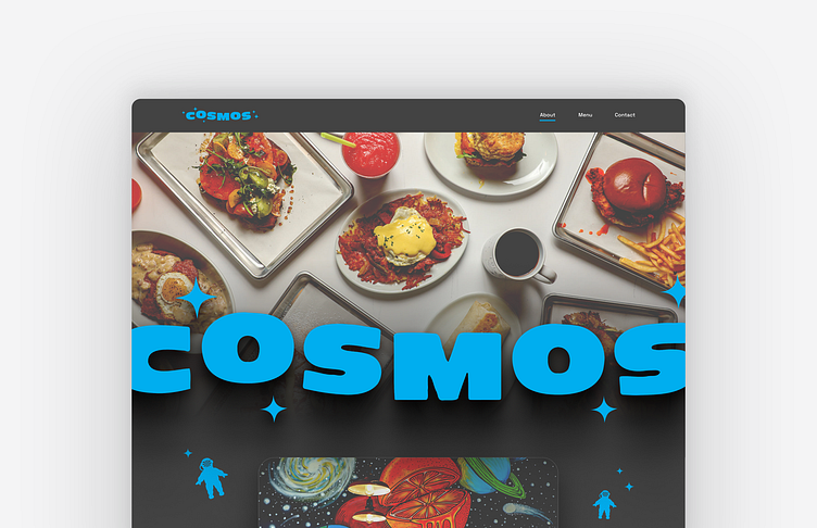
Cosmos Cafe landing page
A landing page for a Cafe called Cosmos. The owner wanted a funky feeling page that showed an about section, menu, instagram & contact sections. The layout is a little complex with graphics, but overall the UX is straight forward and easy to understand. Used dark colors for the space theme- used the space figure and stars to connect the branding to the sections. Also included wavy space lines behind sections to give it more of a funky space feel. Overall its a balance of dark colors mixed with darker colors, which gives it a unique feel- supported with pops of bright blue for links and logos.
More by Paul Altott View profile
Like

