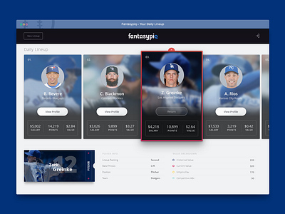
Fantasy Lineup App
Finally getting excited about the Fantasypiq release! The first few ui cards seemed a bit distracting and a few features were cut because of they were deemed unnecessary, but this should give the user a good idea of how to navigate through the cards, and the data according to the value breakdowns they designed. Rethinking the UI was a general response to having to rethink the experience. The user wanted to be able to view the optimal lineup, and continue shuffling through lineup options or drill down enough to see a breakdown of the value to determine if their valuation algorithm needed tweaking based on how their picks preform.
More by Darren Moten Jr View profile
Like

