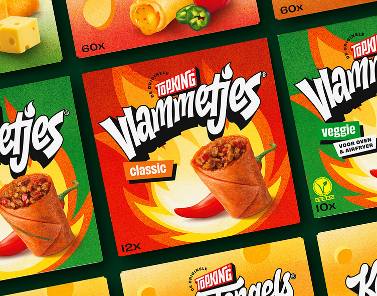
Topking - Logotypes
Topking is an established brand in the Netherlands, known for their iconic snacks like ‘Vlammetjes’ and ‘KaasTengels’. Brum Design redesigned Topking’s packaging and branding to strengthen their positioning and emphasize their Rotterdam roots with a beautiful and bold identity system.
I was happy to be brought on board for the project to design the new Topking logo and the logotypes for their flagship products; Vlammetjes, KaasTengels & Toasties. The challenging part for us was to find a fitting lettering style for each logotype concept while also staying recognizable and undoubtably Topking. During the process we’ve explored multiple typographic directions for the productlogo’s, below are some early drafts for each of these.
For the full branding case of Topking, do check out the website of Brum


