Dribbble Course: Scaling Design Systems - Capstone Project
Introduction
Today, I share with you my inspiring journey through a complex creative project. With IPTS' new identity and the magnitude of demand for the project, it was clear that this project could quickly become uncontrollable. Facing this challenge, I was able to optimize my time, taking tight deadlines into account. This is where my hero, the Design System, came into play, streamlining the design process and ensuring remarkable visual consistency.
From idea to design!
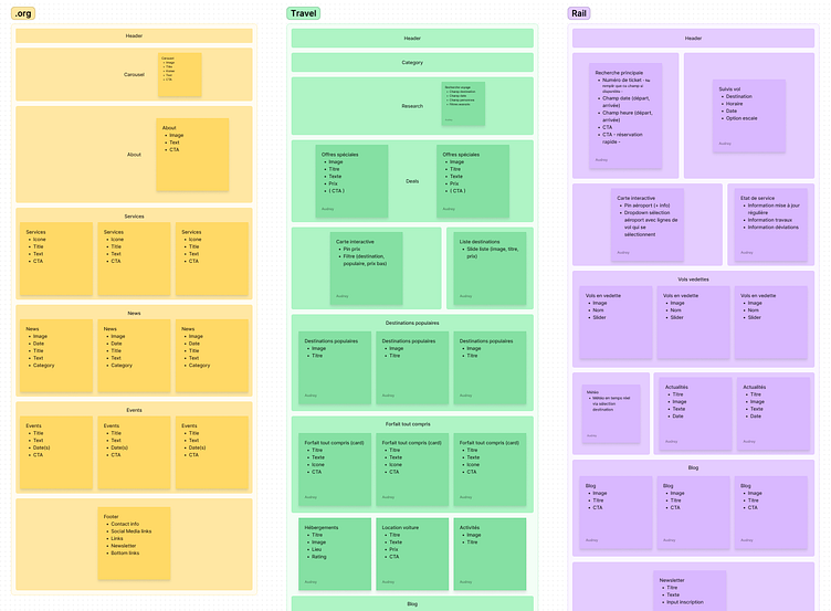
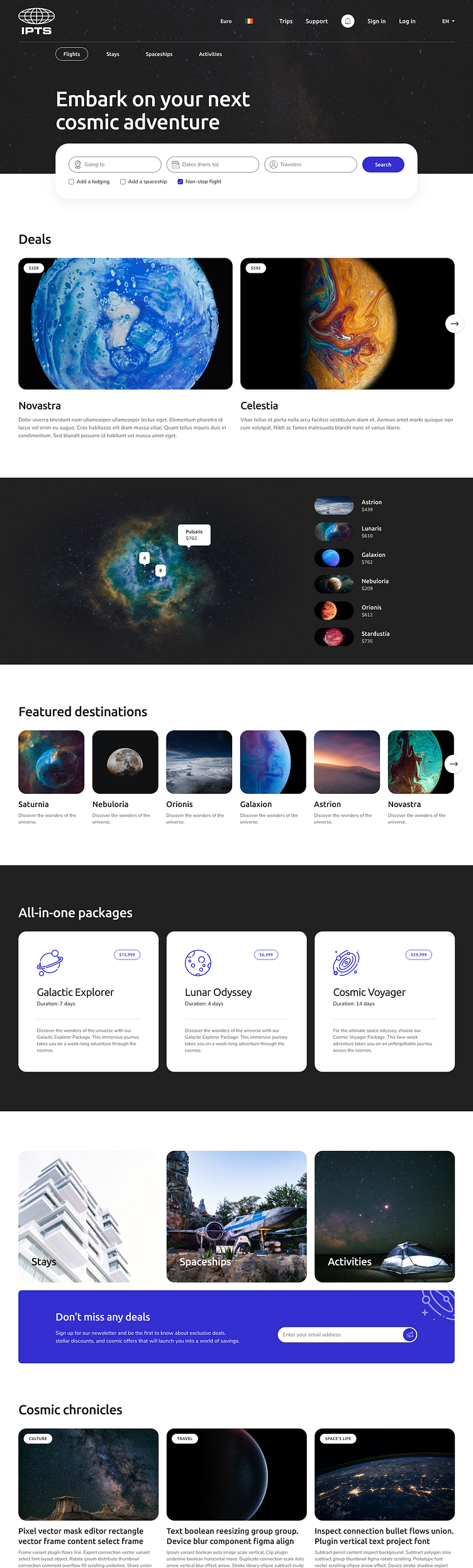
It all started with the creation of a detailed feature list, which provided a clear roadmap for my project. Using Figjam, I planned each element, allowing me to visualize future mock-ups with precision.
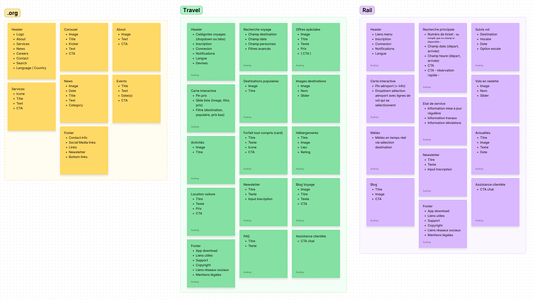
To enhance my creative ideas, I conducted extensive research, analyzing relevant websites to grasp industry best practices.
Once the groundwork was set, I swiftly developed a wireframe to establish the project's basic structure.

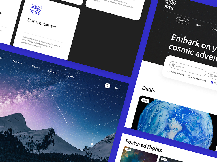
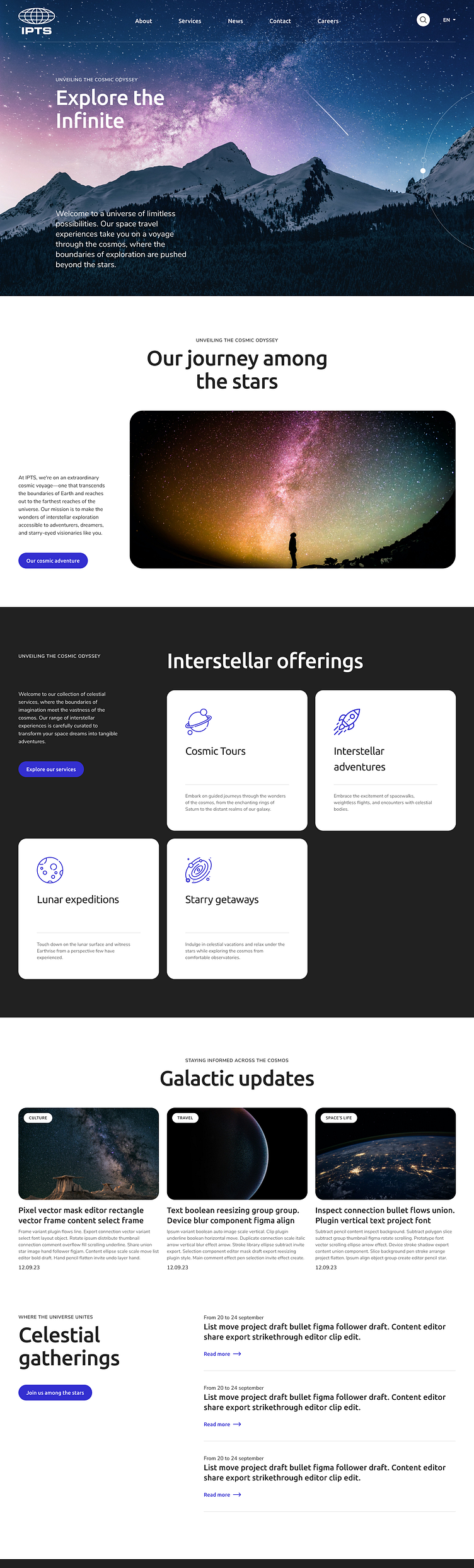
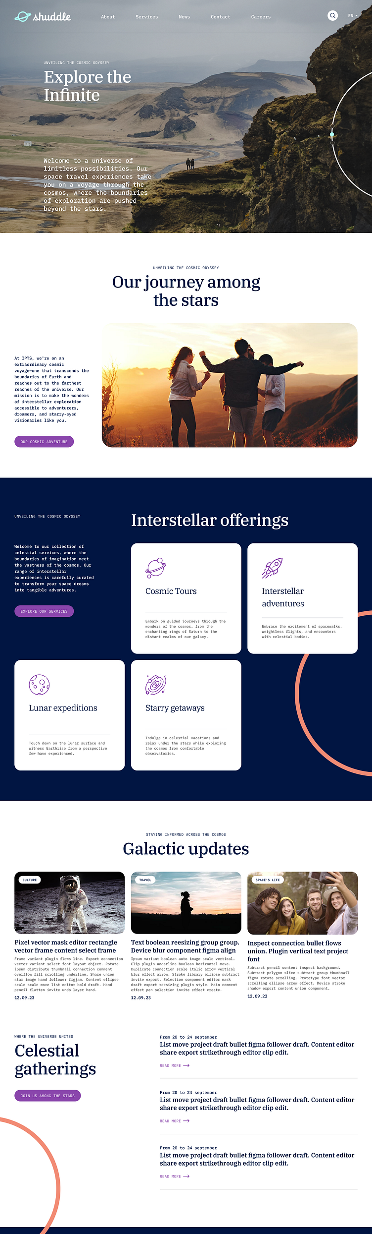
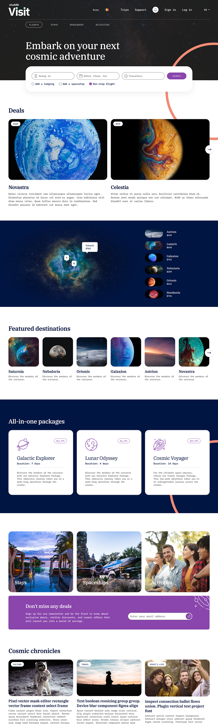
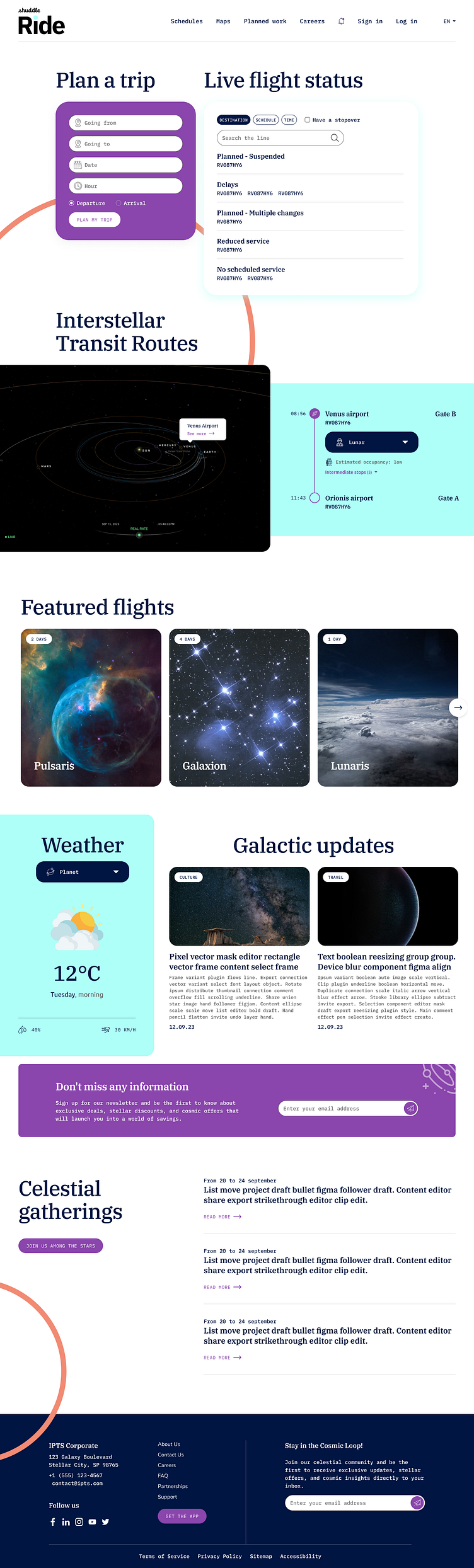
Building upon this foundation, I crafted graphic mock-ups on Figma, giving life to aesthetics and style, and establishing a distinctive visual identity that set the project's tone.
Nevertheless, the challenge was to maintain consistency across all aspects. This involved creating a comprehensive design system, including defining colors, typography, radius, shading, the grid, and layout. These elements provided a sturdy base for my work. Finally, I diligently developed all necessary components to ensure a seamless user experience, and the design system was implemented across all mock-ups, resulting in a cohesive and optimized project....

The Power of the Design System
At the core of the project lies the Design System, a carefully crafted structure consisting of fundamental elements and optimized components. The foundations of this system include a versatile color palette, typography styles, shadow and radius specifications, detailed icons, precisely defined spacing, an accurate grid system, and our company logo. Each of these elements is carefully documented to ensure easy understanding of their use.

Foundation elements:
Colors, Elevation, Grid, Icons, Logo, Spacing, Typography
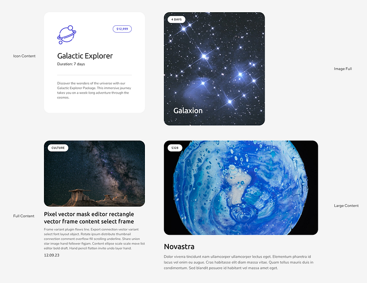
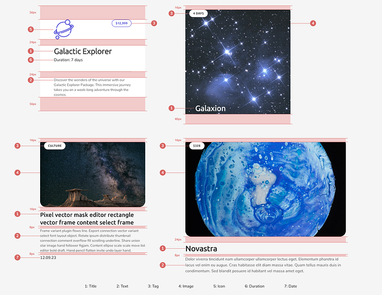
However, the true heart of the Design System lies in the components. Each component has been painstakingly designed to be adaptable to a multitude of use cases through various customization options. Among these components, you will find familiar elements such as buttons, cards, checkboxes, dropdown menus, tabs, and many more. Each of these components is also available in a variety of user interactions, and their integration is seamless thanks to our interactive prototype on Figma.
With the Design System, I can maintain consistent visual harmony while delivering optimal functionality across a variety of platforms and applications. It is this balance between creativity and functionality that allows me to deliver quality products, saving time and ensuring an exceptional user experience.
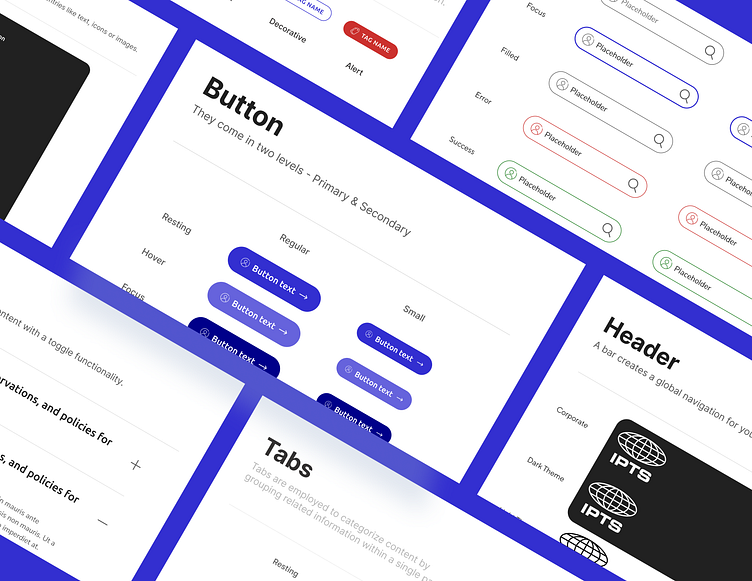
Component elements:
Accordion, Badge, Button, Button icon, Card, Checkbox, Dropdown, Footer, Header, Link, List, Radio button, Tab, Tag, Text Field
The Rebranding Journey
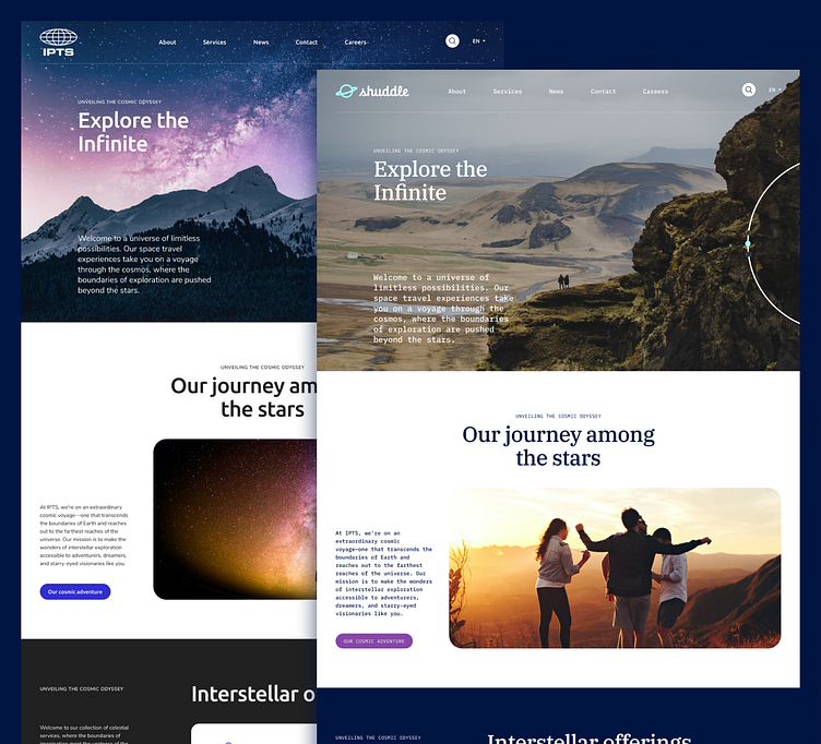
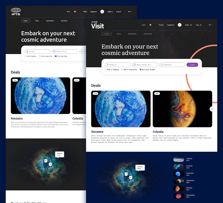
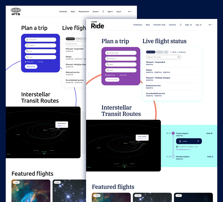
The rebranding process from IPTS to Shuddle was efficiently and swiftly integrated into our design system. It had a minimal impact on the mockups while significantly improving their appearance and graphic atmosphere.
Small Change, Big Impact
The integration of Shuddle's new identity into the design system proceeded smoothly. Mockups were swiftly updated without negatively impacting the workflow. The initial pivotal step involved revising the colors, typography, and logos. Color readjustment was the most meticulous process, given that the palette was more extensive than the previous identity. Time was taken to deliberate on how each color would be utilized in the graphic mockups.
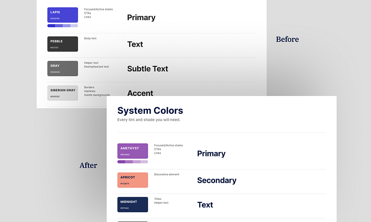


Once all the changes were seamlessly incorporated, an inspection phase followed to ensure the consistency and visual appeal of all components. A few adjustments to borders, typographic menus, spacing, and overall images were necessary. Finally, the eagerly awaited result was achieved! An additional subtle touch was added with the incorporation of circular arcs, a distinctive feature of the Shuddle branding, which were integrated to maintain the importance of the user experience.
This successful transition reflects a fastidious process that preserved the essence of Shuddle while infusing it with a fresh visual perspective. The design system played a pivotal role in this transformation, ensuring visual harmony and essential consistency for an optimal user experience.
Conclusion
The use of the design system presented several advantages during the project creation process:
Brand Consistency: The design system ensures visual consistency and brand uniformity across all websites, which is essential for strengthening brand recognition and establishing a strong identity.
Time Savings: By utilizing pre-established design components and guidelines, one can save time when creating or updating websites, thus expediting the redesign process.
Collaboration: All teams working on different websites can collaborate effectively by using the same design resources, simplifying communication and preventing misunderstandings.
Flexibility: The design system can be adapted to reflect the new brand image while remaining flexible enough to cater to the specific needs of each site.
Adaptability: It enables rapid adaptation to market changes and evolving requirements while maintaining visual consistency
In summary, the design system is a powerful tool for managing the transition to a new brand image while maintaining consistency and efficiency in the development and management of multiple websites. It also optimizes resources and delivers a high-quality user experience.