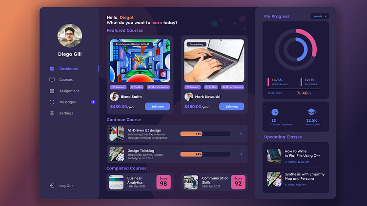
Course Online Platform
The app boasts a clean and intuitive UI, ensuring that users of all ages and tech backgrounds can easily navigate and access content.
Bold Typography: Large, bold typography is used strategically to draw attention to important information and create hierarchy within the content.
Vibrant Color Palette: A carefully selected palette of vibrant and harmonious colors infuses energy into the design, while also conveying emotions and guiding user actions.
User-Centered Navigation: Navigation is structured with the user's perspective in mind, making it easy to find important sections and navigate through the app or website.
Progressive Disclosure: Information is revealed progressively, preventing overwhelming users with too much information at once and enhancing the learning curve.
In summary, the design choices focus on aesthetics, functionality, and usability, harmonizing visual appeal with user needs to create an engaging and user-friendly experience.


