Packaging Design
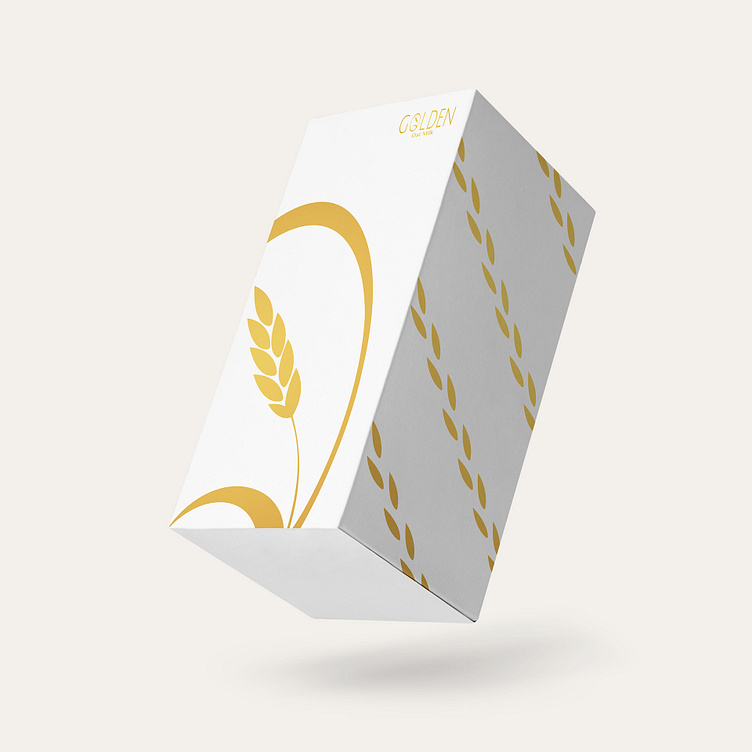
Golden is an oat milk brand that aims to position itself in the market as the new, healthy, non-dairy alternative. Simplicity, honesty and confidence are the brand's core values; the goal is to communicate these in its brand identity.
In order to achieve this, I have created a minimalistic and clean design. The mark is a simple reference to the main ingredient of the milk brand, the oat (enclosed in the word's initial letter). Complemented with a color palette that perfectly captures the essence of each bottle of Golden Oat Milk: the vibrant gold symbolizes the prosperity of the consumer's health, and the color of white conveys the integrity of the brand.
Golden's use of glass bottles further reinforces the brand's values. Its transparency evokes a sense of trust in its consumer while also displaying confidence in the quality of its milk.
See the full project on Behance
https://www.behance.net/gallery/166514663/Golden-Oat-Milk-Package-Design-Brand-Identity
