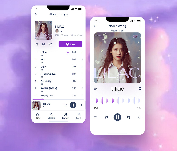
Music player mobile app UI design
🎵 Introducing my Latest UI Design Concept for a Music Player App! 🎧
Hey Dribbblers! 👋 I'm thrilled to share my new UI design concept for a music player app. 🎶 I focused on achieving a minimalistic look, employing a limited color palette and maximizing white space to create a clean and breathable design. 🖌️✨
🎨 Minimalism Meets Harmony: With a conscious effort to keep it simple and elegant, I used a restrained color scheme to let the content shine while maintaining a visual harmony. The interplay of hues brings out the essence of the music without overwhelming the eyes. 🌈
💡 Design Philosophy: My goal was to make the UI intuitive and user-friendly, ensuring that every element serves a purpose and enhances the overall user experience. 💫 The layout is thoughtfully crafted to facilitate effortless navigation and smooth interactions. 🔄
🌟 Embracing White Space: White space isn't just emptiness; it's a canvas for design elements to breathe and stand out. I utilized ample white space to impart a sense of openness and elegance, allowing users to focus on what truly matters—the music. 🎹
🤗 Your Thoughts Matter! Your feedback is invaluable! Let me know what you think about this concept. Feel free to share your thoughts, ideas, and constructive critiques. Let's continue to learn and grow together! 🌱
Stay inspired, and keep creating! 🚀
#UI #UX #MusicPlayer #DesignConcept #MinimalDesign #UserExperience #DribbbleInspiration
