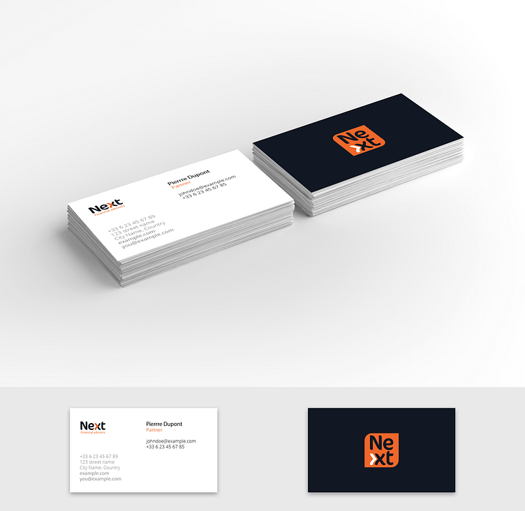
Rebranding proposition for a financial company
Concept:
Proposal to refresh the logo and use a more up-to-date font. Insertion of a graphic element created by dividing the letter "x" into two parts, resulting in an orange arrow and referring to the company name "Next". The colours used were taken from the company's website. The orange hue suggests dynamism and energy. The dark blue tint conveys confidence and reliability.
Primary logo:
The main, or primary logo is the most important and widely used in any logo collection. It's the one that appears on business cards, letterheads and the website - in mediums where the brand needs to be front and centre and quickly recognised.
Secondary logo:
A secondary logo replaces the main logo in the most common way, often by transposing it geometrically. The primary logo shown on the previous page is organised horizontally. This variant allows the company logo to be placed vertically.
Icon:
The icon enhances brand identity. It can be used in very small formats and still allow your brand to be recognised. Here, the arrow element is used on an orange orange background taken from the secondary logo.
Contact
You can reach us at ali.haba@phantomstd.com if you have a project in mind..


