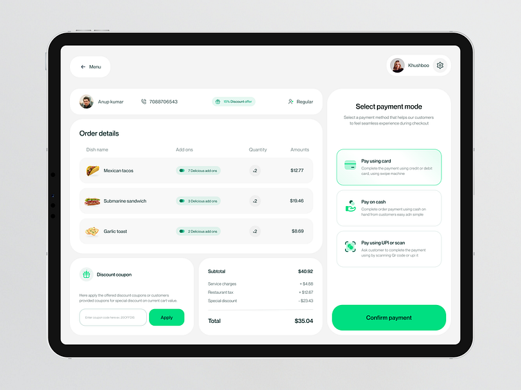
BOWL - POS System Checkout screen
I'm excited to share with you the checkout screen design of POS System dashboard. 💳 I've gone the extra mile to make it incredibly user-friendly and straightforward, ensuring that cashiers can efficiently process transactions even during peak hours with a high volume of customers.
It's no secret that some POS systems out there can be unnecessarily complex, leading to cognitive overload and errors during busy periods. My goal is to simplify the process, reduce errors, and boost productivity. This means smoother transactions, higher productivity, and ultimately, a more successful business.
What do you guys think? Let me know in the comments section!
Hope you guys enjoy it. Press "L" if you like it.
Thank you !!
----------------------------------------------------
I'm available for a new project, let's collaborate -
mitesh.ux@gmail.com
👇Get in touch with me
