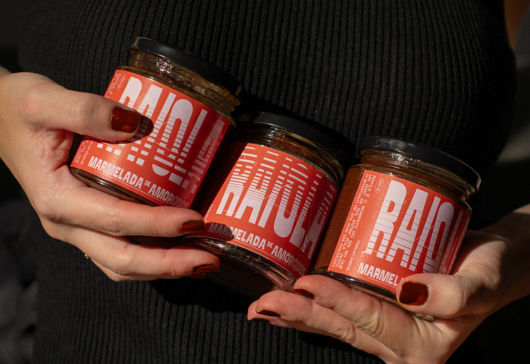
Raiola - Packaging
ABOUT
Naming and identity design for Raiola, a new brand of artisanal jam made in Galicia (Spain).
"Raiola" is a Galician word meaning sunbeam or sunny interludes on a rainy day. Jam is associated with morning and breakfast, when the first rays of sun appear through your window, that's the reason why the name of "Raiola" is selected.
When the rays of sun enter through the window, light creates a fascinating effect with shadows and drawings that are projected above the space and objects. These drawings are different every day, depending on the direction and quantity of light.
We produced different labels with different drawings and shadows, recreating the effect of a blind when the sunbeam crosses it.
The typography suggests curved and polygonal shapes of toast, and colours are related to jam and morning. In addition, the drawn lines show the different sun directions. The result is a modern, delicate and trendy packaging with a variable graphic system.
Enjoy jam and Raiola! :)


