Homes1 Estate Services | LOGO DESIGN & BRAND IDENTITY
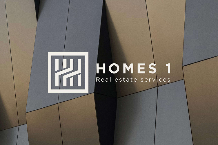
The logo of Homes 1 - a real estate company is inspired by the image of a prosperous and developed city.
The logo symbol is a combination of the image of a high-rise building combined with the letters H and the square symbol. The square shape symbolizes stability and mobility in the real estate sector. It represents the certainty, sustainability and professionalism of Homes 1 in delivering quality real estate projects. The letter H is located in the center of the square, symbolizing Homes. This is the core message of the company, with a commitment to building nice and cozy living spaces for their customers. The square symbolizes stability and mobility in the real estate sector. It represents the certainty, sustainability and professionalism of Homes 1 in delivering quality real estate projects.
Homes1 not only builds real estate projects, but also builds trust and long-term relationships with its clients.
Designed by Bee Art
-
Client Homes1
Logo and Branding Project. Logo is designed for a Real Eastate Company in Vietnam.
Copyright © Bee Art. All Right Reserved
Contact us:
• Hotline/ Zalo: 077 34567 18
• Email: info@beeart.vn
• Website: www.beeart.vn
• Facebook: https://www.facebook.com/BeeArt.vn


