A better Google logo?
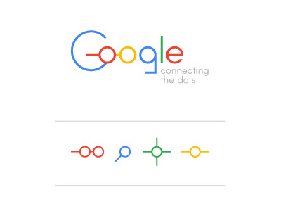
Google stunned us with it's new logo and Guardian newspaper has challenged the public to come up with a better one, if they can. Here's my shot! The concept behind it is Google connecting the dots - allowing us to make sense of information and connect to it every day. Thus the o in the main logo became this connected dot and also a versatile element to be used in other instances (and also appear as a pair of goggles? :) Is it better or worse? Let me know in the comments :)
